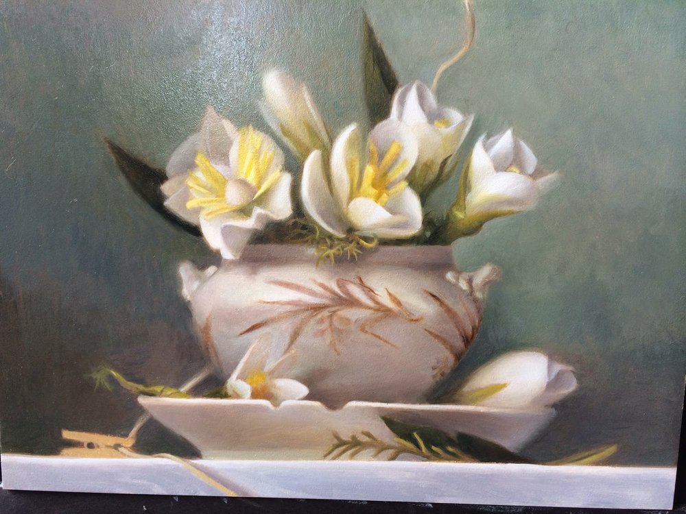
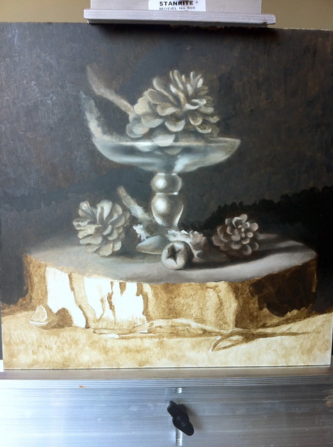
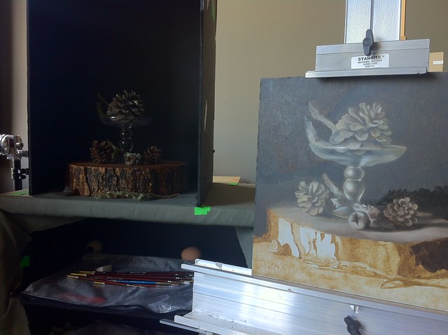
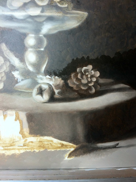
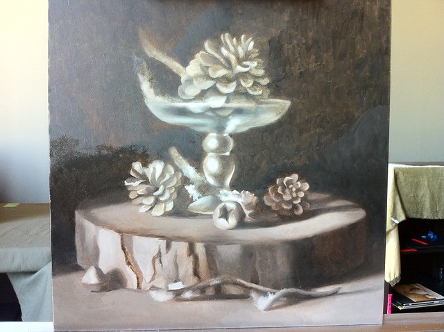
My Latest Studio Work/Progress on Final Color Pass

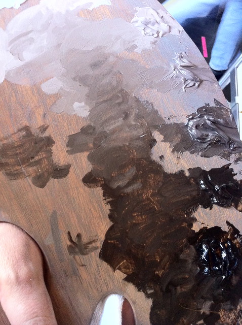
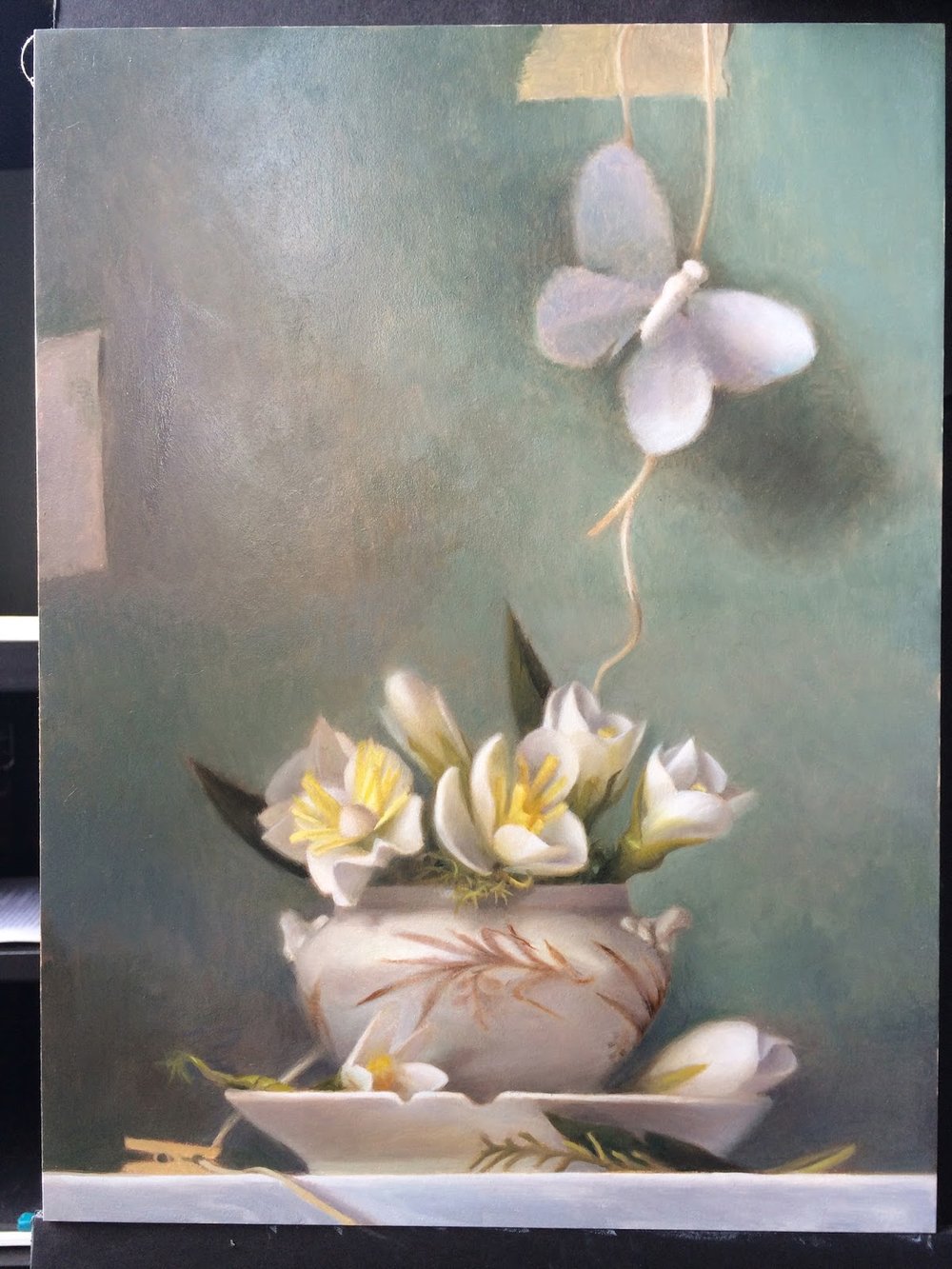
First session after finishing the initial color block in stage. I spent most of this session looking at the value relationships between the white of the vase (which was really a very warm-grey), the white of the board the entire set up is sitting on, the white of the flowers and the white of the butterfly. I spent a good deal of time in this session comparing between the four white areas, trying to see what the difference between them was. 
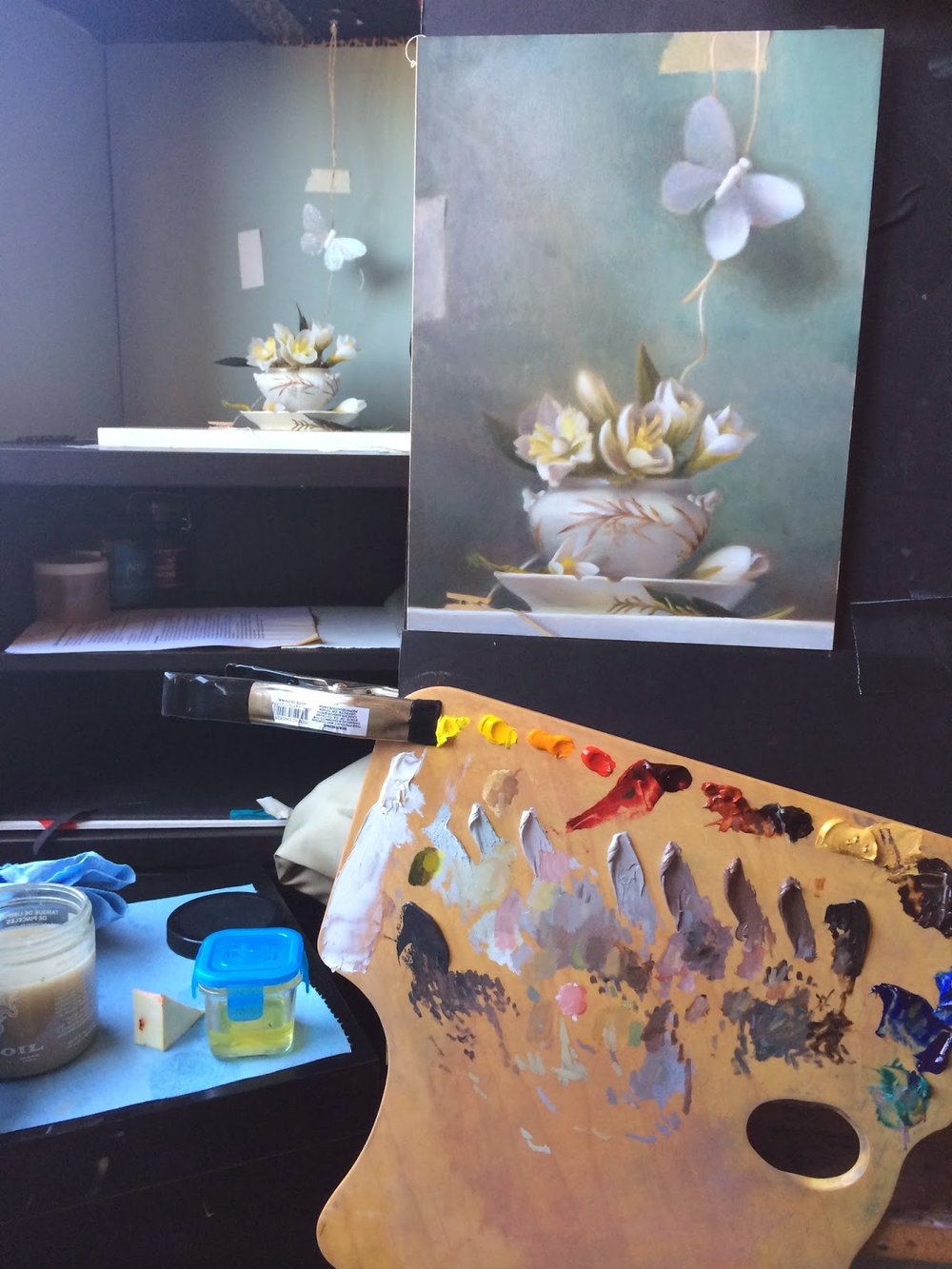
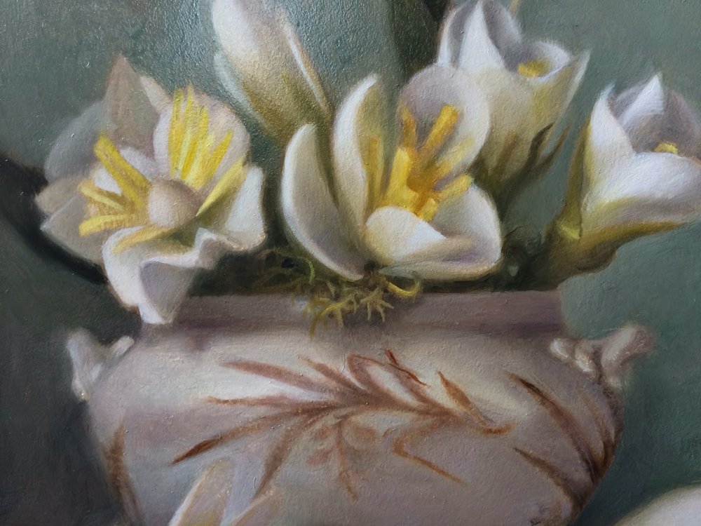
 I focused first on the flowers. In the first color block in, I felt that the shadow areas were getting a little too dark and muddy, when what I wanted was luminous colors even in the shadow areas. I painted over all of the shadow areas of the flowers and strengthened the white areas. I also pumped up the contrast on the yellow flower stamens.
**************************************************

Second session of the final color pass:
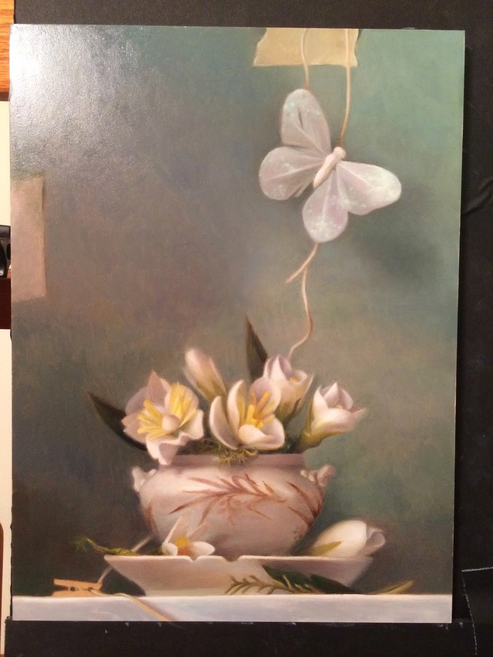
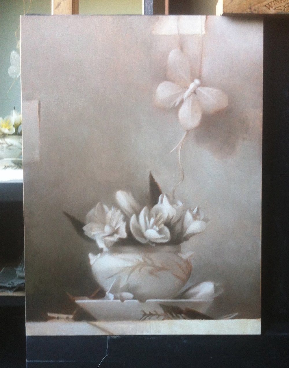
The focus of this session was on the butterfly held up by twine. The butterfly is made of white feathers, paper mache in the body, and has iridescent glitter all over the wings, making it a difficult challenge.

Sadie suggested that instead of painting each and every little dot of glitter, that I paint large swaths of blurry color - the shapes of the areas instead of pieces. I also remembered a passage in James Gurney's book, "Color and Light" about painting scales on a dinosaur. Instead of painting all of the texture everywhere, he recommended only painting the texture in the light, and especially in the highlighted area. As the textures moves into less illuminated areas of the form, it will become less and less apparent to the eye.

This was as far as I chose to push the glittery iridescent areas of the butterfly. In the next few sessions during the final pass I will revisit both the glitter areas and the string. 

**************************************************

Third session of the final color pass:
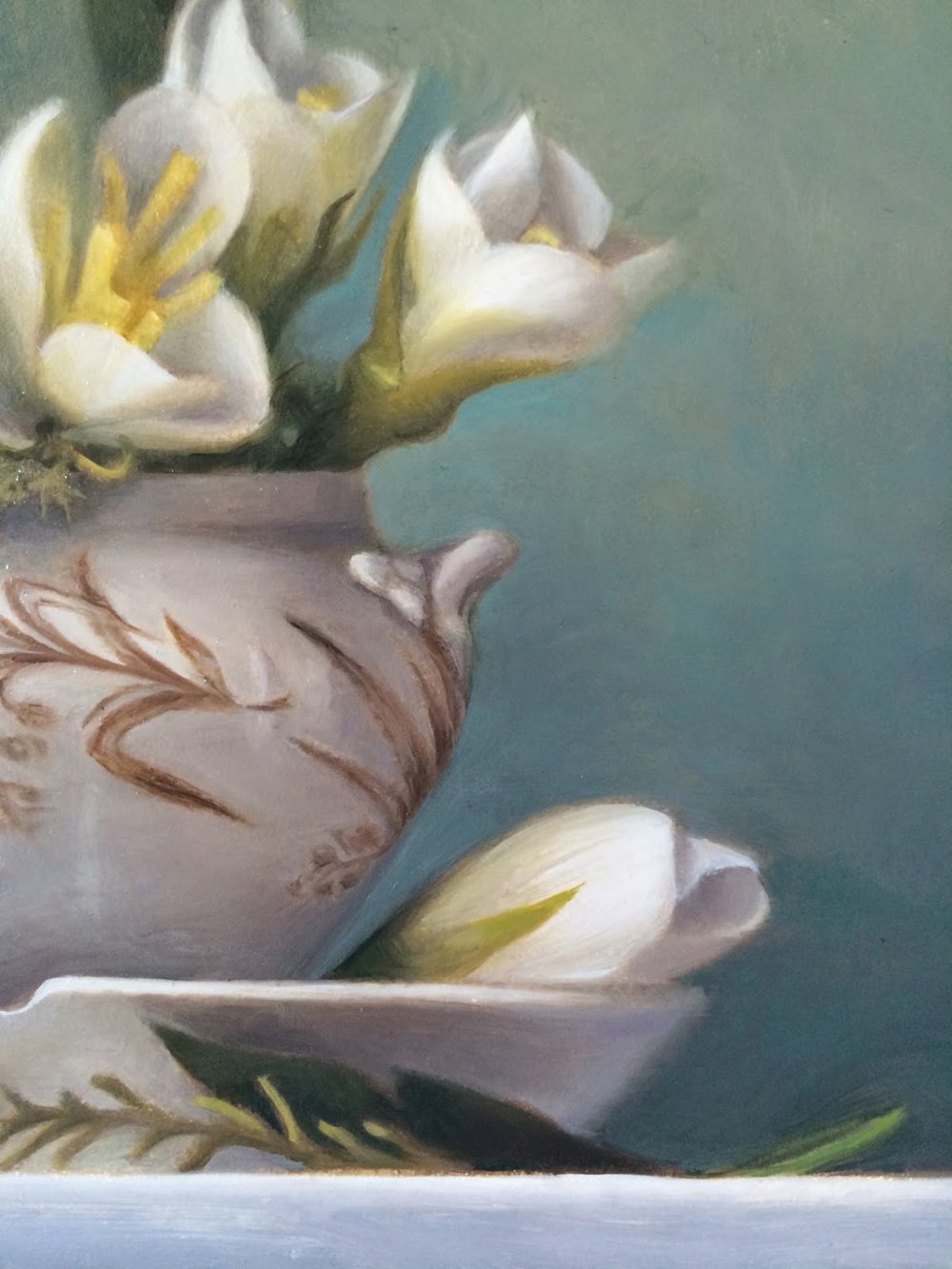
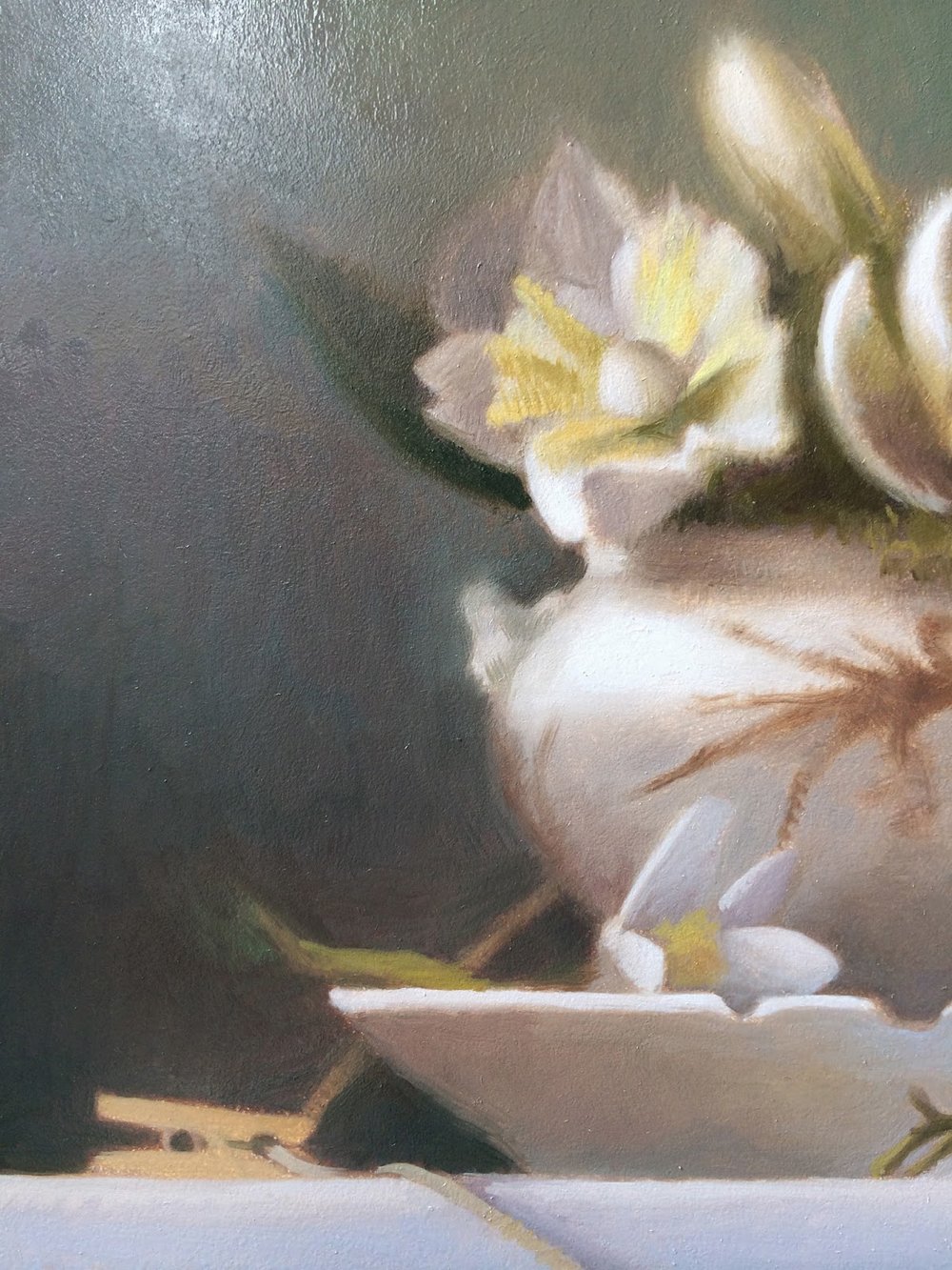
I spent almost this entire session working on the pattern on the vase and the color shifts in the shadow areas of the white areas in the vase. 

I often struggle painting white objects. As I am observing the scene in front of me, I can clearly see the light area vs. the shadow side. But when I've sat and observed these same objects over a long period, like today's five hour session, my eyes begin to pick up the subtle hue shifts, bounce colors and variation in the value. 
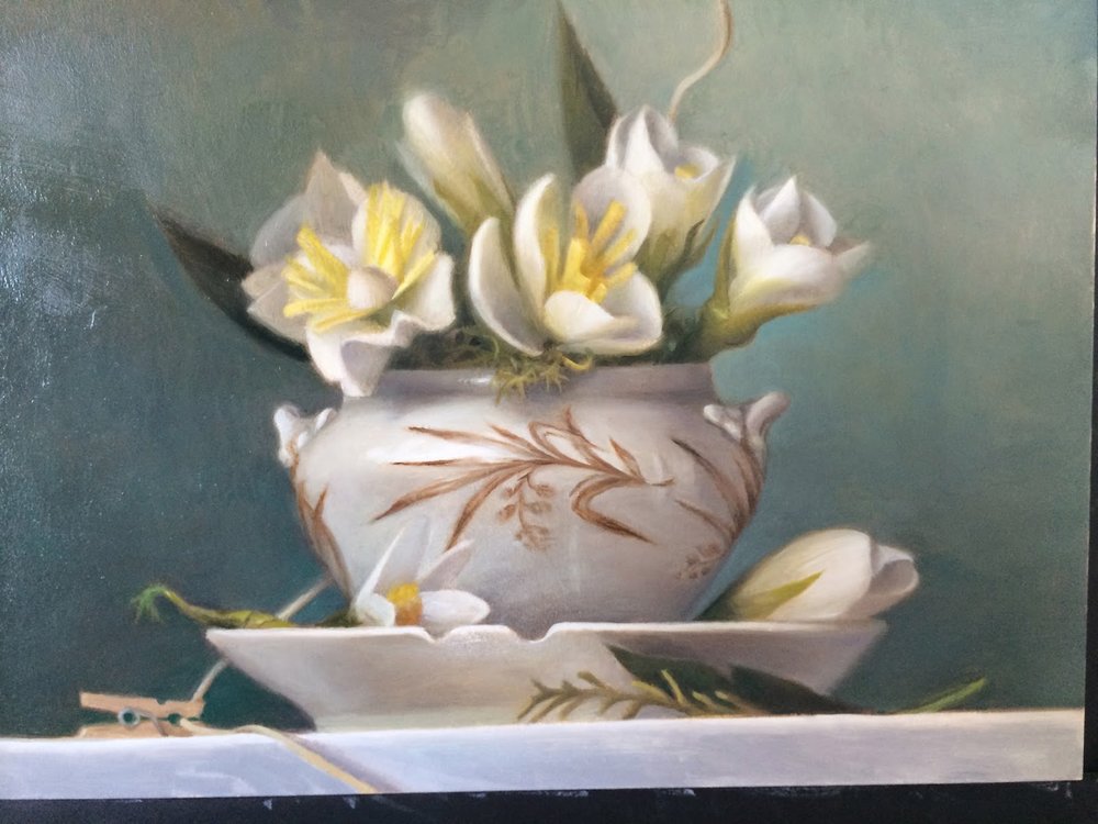
In the past when I'd worked in the alla prima method (direct wet on wet painting) I would just simplify these areas for the sake of turning the form, with the brush work always on stage, so to speak. The Flemish indirect method, on the other hand, provides the opportunity to get the subtle variance of the light on the form by building up layers and layers of paint. With layering, you can push and pull areas into and out of focus, glaze areas, and continue to soften or sharpen edges endlessly. All of this makes it challenging to make decisions. I've resigned to working out the "mood" of each area in relation to the whole piece.
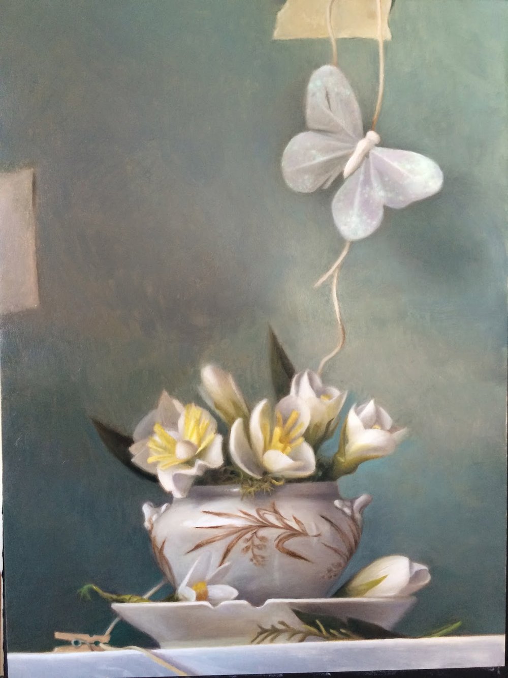
For the final finishing details in the next 2-3 sessions, I plan to work on the gradient of the blue-green in the  background. Working over many sessions, the color in the background has begun to creep a little. Some areas are not matching previously painted areas. That happens because each session I am working on a specific area and need to mix up the surrounding background paint color so that I can soften the edges.

In the next few sessions, I will work on smoothing out the hue shift and the shadow areas so that it is a little more harmonious. I might also make the green-blue a little more saturated. The flowers still have a few textures and details that are not yet depicted, and the glitter on the butterfly is not quite there yet. Last but not least, the pattern on the vase…is it too dark? I will most likely add a light glaze of vase color on top of the pattern in the center so that it does not call itself to attention so much.

Thanks for reading!

Latest Studio Painting/1st Color Pass Finished

Sunday is my painting day. I paint from about 10 am until 4 pm, using that time as efficiently as I can. I put on my headphones, crank up the latest history lecture I've been absorbed in, and paint. My painting space currently is one of the still life stations at Sadie Valeri's Atelier, which has excellent light and overall great art vibes. I really enjoy watching new students learn and go through similar trials and tribulations I went through as an art student. The dedication and determination is so concentrated that it permeates the air and makes me feel motivated all week long. It is an experience I feel fortunate to be a part of. 


This past week I finally finished the first color pass on my latest still life painting. This pass is about establishing the main color relationships in general terms rather than details. At this point, I will go into the fine details and creating areas of focus.  Below is a series of process images from the closed grisaille state into the 1st pass color stage.


The finished closed grisaille, the 2nd underpainting that establishes a full value range. Although as an alla prima painter by training I've never separated out the value stages in this way, I've found that painting the grisaille has enhanced my understanding of how deeply value relationships are tied to color. 


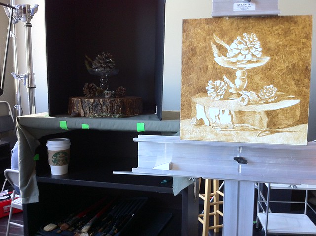
Beginnings of the color pass. There is a subtle range of color going on in the light areas of the flowers. Instead of focusing on those colors, I've painted them pure white in this first color pass. 


 In this stage I am also focusing a lot on the edges of things, making edges very blurry instead of sharp in any one area.


The details on the vase are painted very softly on purpose. Later when I work on the final color pass, I will sharpen up the detail where needed, including the highlight area which falls over the flower details of the vase.


Notice how blurry the edges are all around the subject. In fact, I probably should have painted them even softer. 


After the flowers and vase hues were painted, I began working on the hue shift in the background area from the bottom left up toward the top right. This is not necessarily a smooth transition in the actual set up, but an improvement in the light pattern that I felt worked better for the composition than what is actually happening in reality.


As I moved toward the butterfly and the shadow underneath it, I roughed in the color in very simple terms making sure to leave the edges extremely soft. The tricky part of this area is going to be the glittery, shimmery surface of the wings, which are feathers that have glitter applied to them. Instead of painting all of that detail, I just noted general colors and made the upper right area pure white.


The finished butterfly. I sharpened up a couple of areas in the light, but left the rest very soft.


The finished first color pass. As you can see the background gradient is still quite rough, as are patches in the vase and flowers. All of this will be addressed in the next stage as I refine the painting.

***********************************************************************

Meditations on Still Life Painting


 The subject matter in my painting is a little odd, I know. When I set it up, I had been thinking about the fantastic dioramas in the Chicago Field Museum and thought I'd try recreating that feeling of an artificially arranged environment. Instead of using real flowers in my set up, I crafted paper flowers which I dipped in wax to preserve their shapes. Likewise, the feather butterfly is not a real preserved butterfly, but is instead crafted. I chose to show the way I set up the still life by including the string, clothes pin and tape so that the viewer knows this is a set up and is not real.

As a modern viewer of any still life painting, the audience knows that the subject has been set up by the artist, every detail carefully composed, including the direction of the light. We have a relationship to narrative painting that is different than it was in the past.

Dioramas from the Field Museum in Chicago. Taxidermy animals displayed in an artificial environment  made to look real, depicting a certain narrative of a scene that might have occurred in real life. The images in the far background are realistically painted murals. The foliage and tree branches are silk, wood and painted plaster.


Originally, still life arrangements were not seen with the same eye as we see them now. Natural History dioramas and still life paintings were similar in that they were narrative arrangements that represented a story to the viewer about something not widely known about the world, like animals on the plains of Africa or they were representative of religious beliefs or values like in many of the Flemish still life paintings of the 16th century. Viewing these depictions in our modern era, we know more about these subjects due to availability of travel, familiarity brought to us by stories told in film, the wide use of photography in remote places, and globalization via the internet. As a result, the still life in the traditional sense now holds less importance to us as an informative vehicle than it has been in the past. 


And yet, I am an artist in this modern age who has a desire to paint elaborate and narrative depictions in the still life format, creating the cart before the horse, so to speak. I wonder if in our modern era the tradition of still life painting can bring to us something of equal value or perhaps something new and different. It is a question I am thinking about a lot as I work on this painting. 

Advanced Open Studio with Sadie/ Part Four

In my previous post I finished the first under painting layer, the open grisaille, as part of my instruction at Sadie J. Valeri's Advanced Open Studio. After the open grisaille dried, I moved on to the closed grisaille.

When I first learned about the Flemish method's multi-step process, I did not understand the reasoning behind making a neutral tone underpainting, thinking it laborious, especially coming from an alla prima direct painting background where painting is quick and results immediate. However, after going through the steps, doing a lot of reading and research, talking with Sadie, visiting museums, seeing Sadie's paintings and other classical realist paintings, I have come to realize my painting education has been incomplete. The closed grisaille has been pivotal in not only understanding value ranges and creating luminous color, but also in opening my mind to the incredible painting processes that existed before Impressionism.
 ************************************

Closed Grisaille


The purpose of creating an under painting is to bring the values, (the black and white tonal range) of the subject closer to reality. Sadie described it to me as becoming 50% closer to reality with each successive layer that we work on. In the first layer, the open grisaille, we broke down the shadow vs. light areas. In the second layer we make a full value opaque tonal painting, which acts to prepare for the color layers and, in addition, aides in creating luminosity and softness in the color stage.

From Adrian Gottlieb's online glossary: "Underpainting:  Also called dead coloring, under painting was once one of the most commonly used techniques in oil painting but fell into almost total disuse among contemporary painters. 
From the beginnings of oil painting, under painting has been an essential stepping stone which permits the painter to rapidly define composition, lighting and the atmosphere of his or her work. Under painting is the painter's guide through an often long and laborious process that allows the painter to develop a clear vision of the overall sense of the painting although it is usually entirely covered by successive paint layers.
[Generally] under painting consists of painting a monochrome version of the final painting.  Under painting is part of a step by step method that was common practice among European painters and is still taught at ateliers and academies teaching historic techniques and methods today."

Richard Frederick Lack:  "A mixture of Flake White, Ivory Black or Mars Black and the addition of a small amount of Raw Umber for warmth are all the pigments necessary for a grisaille study." ***note: in Sadie's studio study we are using titanium white, burnt umber,  and ultramarine blue.

There is a pre-order of Jon deMartin's dvd on closed grisaille painting, which promises to be be an excellent resource. Check out the preview HERE. (available for purchase on July 3rd, 2012 - I think I will order this one!)

 ************************************ 

Historical


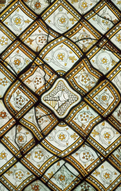
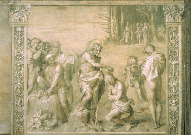
During the 12th through the 13th centuries and possibly earlier, grisaille painting was used in stained glass mainly as a decorative addition to the colored glass. Some grisaille painting was also used in narrative panels in churches throughout Northern countries such as France, England, the Netherlands.

Two Grisaille Panels, 1320–1324
French; Paris, from the Chapel of Saint-Louis, north aisle, royal abbey of Saint-Denis
Pot-metal and white glass, silver stain.

At this time, grisaille was also used in the southern countries of Europe in plaster fresco painting to imitate bas relief sculpting in everything from churches to civic buildings, particularly in Italy.


The 15th century Flemish oil painting method incorporated grisaille, as discussed in the previous post by Jan van Eyck, also a period sometimes referred to as "Early Netherlandish Painting".

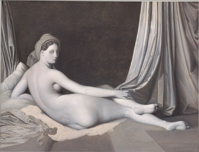
Later, grisaille was used by many of the 19th century French academic painters, like Ingres, as in the example below, who were intrigued by Flemish painting methods.
 Odalisque in Grisaille, ca. 1824–34
Jean-Auguste-Dominique Ingres (French, 1780–1867)

Today, many modern Realist artists also make use of the grisaille. It can be beautiful in and of itself; some artists use a combination of grisaille and glazing. For study purposes it is a useful method for training the eye to see value ranges, and is often taught for cast painting and figure painting in a classical ateliers. Check out this link for a beautiful Colleen Barry partially painted closed grisaille with the open grisaille exposed underneath, HERE.

 ***********************************

Method


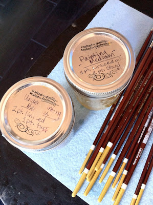
This stage continues to make use of underpainting medium as a way to make the paint flow if it is not fluid enough. However, I found that I rarely used it, probably only a few times at the start, and not very much. In my last post I neglected to mention the recipe of the underpainting medium. Here it is:

Recipe: 2 parts linseed, 1 part odorless turp

***note: use fine sharpie to mark parts on side of glass, mark top of jar "underpainting medium". I am using ball canning jars.


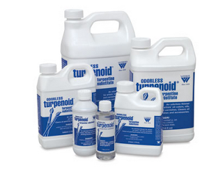
Use either Turpenoid or Gamesol brand Odorless Mineral Spirits. There are many linseed oils available.


************************************ 

Value String


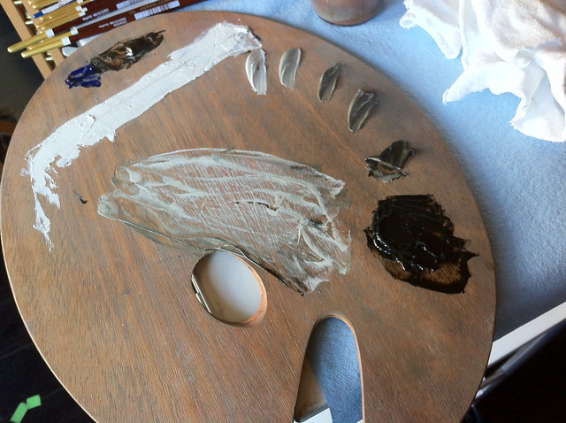
The purpose of mixing up a value string is so that you don't have to mix up values on the fly while working. It saves a lot of time to premix seven values moving from pure white to black, as you can see in the photo below. Sadie instructs us to use seven values, which I find to be more than enough to describe the tonal range of any given subject.

When I first mixed up my value string, I made the values much too cool, using far too much ultramarine blue in the mix. Sadie told me that the value string should lean more towards burnt umber rather than ult blue. Apparently when the under painting is too cool it will create an unattractive pasty effect that is difficult to deal with in the color stage. Also, in a cool North light situation, the light areas will always be cool while the shadows are warm; the warm tinted underpainting ensures the shadows will always have "life" and warmth.

IMG_2621

Also notice how the white paint is spread out in a thin strip. This is so that I can get clean pure white when I need it. Below is what the color looks like after I've been painting awhile. You can see how warm the neutral grays are.

IMG_2662

************************************ 

Technique


***note: There is an unfortunate glare on some of my photos due to very strong light in the studio. Hopefully you can get a general sense of the scene. I will try to improve my photos for the following posts.
 
I didn't really know where to begin, so I started on the easiest, the very dark, almost black background against the lighter pinecone, which is the focal point of my painting. The two sticks that move into the dark area are covered with lichen and heavily textured. Sadie instructed me right away to paint these almost blurry, soft and to avoid all detail, focusing only on the general effect of the value on each area against the black background.

IMG_2587

In my last post I used the underpainting medium more often, dipping the edge of the brush into the medium and then sopping up the excess with a paper towel. In this stage, it is not necessary to do that since the paint will be opaque. The point is to get the paint to flow off the brush and on to the panel, but not have it so fluid that it is transparent and drippy. Most of the time I did not need more than a tiny bit on my brush. Once that bit was mixed into my paint as I worked, the paint seemed to be fluid enough to continue to work for quite awhile. 


IMG_2588

It took me awhile to get used to painting this way. I wanted to get into every little value shift and fully describe everything. Sadie pushed me to move on quickly. In fact, Sadie instructed me to make all of the painting soft with no sharp edges anywhere in the painting, at all, setting up the painting for selective focus in later color layers.
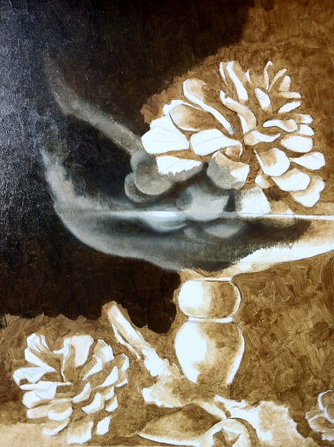
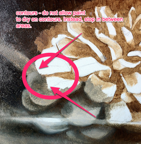
I wasn't able to finish very much of the grisaille that first day and had to stop. Sadie instructed me to avoid stopping for the day on a contour, explaining that paint will form a hard edge when it dries, making it difficult to soften in the next session and in later layers.

IMG_2596


IMG_2597


Unfortunately, that is exactly where I stopped for the day. As a consequence, I will have some difficulty in making those edges soft. This is what practice is for, though!

************************************ 

Next Session


I began the next session by applying a very thin coat of linseed oil on the open grisaille, taking care to not apply too much as the the oil will slowly drip. To make sure I did not apply too much, I wiped off the coat of oil with a blue "shop cloth", which made the layer extremely thin.

The highlights on the glass piece are in reality MUCH smaller than they are depicted here. Sadie instructed me to make a large "glow" around the highlights, blurring out the edges so that in later stages I can work up to making the highlight soft and luminous, working up to the point of light rather than dotting on opaque paint. 

IMG_2626

IMG_2630

It is difficult to leave the highlights so large knowing they are not like that in reality. They jump off the panel every time I look at this underpainting, forcing me to be patient for the subsequent layers.

IMG_2633

After painting the glass and the pinecones, I began working on the heavily textured tree slice that I am using as a base. Sadie told me that instead of worrying about all the texture, to just paint the large value shifts from one end to the other, capturing the effect of light and keeping the edges soft.

IMG_2657

In this photo below you can see how small the highlights are on the glass pedestal. Also note how transparent the shadows are in the painting.

IMG_2658

Sadie instructed me to paint the left side of the tree trunk base lighter than the value actually is. I painted the entire left side around a value 2 or 3 in order to get a sense of light in the painting. Also, instead of painting the shadow areas opaquely, they are painted thinner with less paint. I concentrated on opaque lights rather than building up a lot of paint in the shadows.

IMG_2660

Below is finished closed grisaille underpainting. Because I worked on the grisaille more than one day, my warm-grays do not match precisely, even though I tried to be accurate when I mixed up my value strings. Since the underpainting will be completely covered, this will not matter, as long as the passages lean toward the warm rather than cool.

IMG_2683

IMG_2682

I had about a week in between sessions. The painting was quite dry by the time I began the color. If painting at home continuously, make sure the grisaille is completely dry, either one or two days, depending on the humidity. Do not start the color layer if the grisaille is not dry.

**********************

Please stay tuned as I move into the color stages and share my research notes! Thank you for reading!


Advanced Open Studio with Sadie/Part Three

Continuing on from my last few posts, after I transferred the drawing and varnished it, I began on the open grisaille, the initial application of paint on a white panel, which I documented in detail below as a part of Sadie J. Valeri's Advanced Open Studio.

Before I was introduced to a classical realism, I was completely unaware of the term "grisaille". My fantastic oil painting teacher at the at the American Academy of Art, Ted Smuskeivich, introduced us to an under painting technique which uses a warm earth color painted loosely connecting all the shadow areas in one continuous tone leaving the white of the canvas open to represent the light areas. Even though he did not call this method an open grisaille, I recognize now that is what it is.

It has made me think that there must be many adaptations of the grisaille. My watercolor teacher, Irving Shapiro (who was also the Director of the school), used an under painting method of sorts, painting all the shadows as one large connected shape with warm color transitions in the shadows, painting the lights last. I am sure there are more adaptations and variations out there. I have often read about warm under paintings using different mediums underneath the oil, like acrylic paints and even egg tempera.

 At Sadie J. Valeri's Atelier we are learning the full classic method, called the Flemish Technique, which consists of many layers of paint, starting with the open grisaille. The Flemish Technique developed in the early Renaissance when artists were looking for paints that could be manipulated more finely than the quick drying egg tempera. After oil painting in this manner was introduced by Jan and Hubert Van Eyck in the early fourteenth century, it's popularity spread throughout Europe. To read more about the Flemish method and it's cousin, the Venetian method, HERE is an excellent article by Virgil Elliot and a link to his book on classic oil painting HERE.

The Ghent Alter Piece, Jan and Hubert Van Eyck, 1432
HERE is an excellent website that allows you to select each panel and zoom in to see amazing detail on the paintings. Check it out!

******************************************************************

What is "grisaille"?


From Adrian Gotlieb's online glossary: "Term applied to monochrome painting carried out mostly in shades of grey. The use of the French word can be traced only to 1625, since although grisaille painting was done in preceding centuries, it was not referred to as such...at the time of it's origin, in the medieval period, grisaille painting was simply called 'painitng in black and white'"

Grisaille painting was commonly used in the medieval period to imitate bas relief sculpture. In the Flemish oil painting technique, the grisaille functions as an underpainting, first painted transparently in a warm hue that leaves the canvas exposed in the light areas, termed the "open grisaille" and afterwards a second pass termed the "closed grisaille" is painted in opaque warm neutral greys before the final pass of the color layers. This blog post focuses on the open grisaille that I am learning during Sadie's Advanced Open Studio.

******************************************************************

Open Grisaille

Clean brushes before beginning:

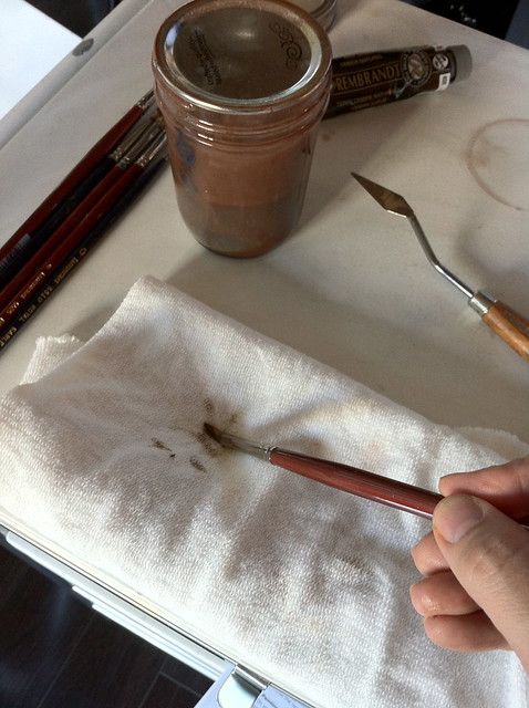
Sadie introduced us to this excellent system of cleaning brushes. This is all new to me. In the past I simply washed my brushes with odorless mineral spirits in between color changes and then used dish soap at the end of the day to clean my brushes. There is a better way to clean brushes - Natural Turpenoid!


I filled a silicoil jar with natural turpenoid and have been using it to wash my brushes at the end of the day, leaving the turpenoid on the brushes. However, it is VERY important to remember when you next begin to paint to clean the natural turpenoid OFF of the brushes before you paint; this stuff is designed to strip paint off and not something you want IN your painting! It is ok to leave the natural turpenoid on the brushes overnight because it will  actually protect the brushes. When ready to begin painting, wash your brushes in odorless mineral spirits to make sure they are free of natural turp.

******************************************************************
 Brushes: 

From Sadie's painting materials list: "I highly recommend Robert Simmons “White Sable” brushes with the maroon handles and white bristles, the very best for an affordable price.
There is a national shortage of the Robert Simmons brushes, if you can’t get them, please buy any brand of soft imitation sable brushes - not bristle.
Filberts, 2 each of sizes #10, #4, and #1
Rounds, 2 each of size #1"

 ***note: I bought several in each size. I've found while painting later layers it is useful to have several brushes.

******************************************************************
 Painting:
IMG_2573

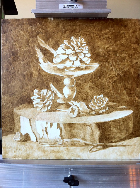
The idea of the open grisaille is to simply paint only shadow areas and also to have some paint on the panel so that subsequent layers of paint can adhere. Another advantage of creating the open grisaille layer is that you begin to clearly observe the light and shadow areas on the set up.

The first step is to put a small amount of raw umber or burnt umber on the palette. I chose raw umber as my under painting color because it is slightly cooler than burnt umber. My still life set up has a lot of cool earth tones, so I felt this color was a good theme to start with.

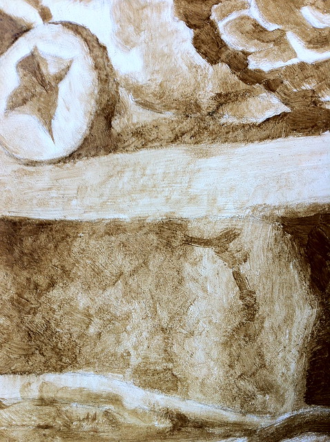
Technique: Rather than applying the paint like watercolor, it needs to be somewhat dry. In order to do this, Sadie instructed me to dip just the tip of my brush into the under painting medium and then on to a paper towel to dry out the brush. It is one of those things that sounds easy when put into words, but when practiced is a bit tricky. Sadie corrected my tendency to over-wet the brush many times while I worked on this stage.

IMG_2572

Sadie also recommends using blue shop cloths from a hardware supply store instead of cotton cloths, which I am using here. Cotton or paper towels (even Viva brand) have too much lint, which will build up in the painting. The idea is to have as little lint and dust as possible in each layer of paint.

IMG_2546

I started with the main pine cone working up from the shadows into the dark background. Do not be tempted to over render and get everything looking nicely modeled. Instead, work on painting the shadows and small amounts of transition areas into the light, leaving the light areas open completely.

IMG_2575

The light passages are *not* a thinned down wash of paint, rather are dry brushed paint scumbled lightly on the panel.

IMG_2576


IMG_2574

My completed open grisaille.

IMG_2579

It took me about a day's worth of work to finish this, approximately six hours. At first glance, it might seem like you could blow through the under painting really quickly. However, it is worth slowing down and taking the time to carefully work through each area.

Take a look in the photo below how finely Sadie paints her open grisaille. No wonder her paintings, especially seen in person, are supreme!

*selected from an online article,
"Precise Line, Value and Color, by Sadie J. Valeri", artistsnetwork.com

******************************************************************

***note: As an aside, it is worth mentioning that the Flemish method on wood gessoed panel is excellent for small to medium works, however it becomes impractical the larger the painting is. The wood gesso panel reaches a tipping point in terms of weight the larger it becomes and the technique itself is time consuming; very large works can take several months or more to complete. Also, when working large, the painter can get away with a certain amount of looseness because the viewer tends to stand farther away to view the painting. It was because of these impracticalities that another variation of this technique developed in Venice, called the Venetian Technique, which uses canvas instead of heavy wood. You can read more about it's development by Titian and Giorgione HERE.

Please stay tuned for the next installment, the CLOSED GRISAILLE.

NOTES ON DRAWING METHODS

From about 2010-2014, I studied painting at Sadie J. Valeri's 19th century French style Atelier. Given that Sadie's course covers construction and straight line block in, I wanted to spend this entry notating various drawing methods to make sure I have a clear understanding of each. This is not a part of the course study, rather a culmination of my own research. I am sure there are more systems of drawing out there; these are the primary representational methods and theories that seem the most popular. Please leave comments if you find something important that I am unaware of.
**********************************************     

Sight Size

Sight size is a 19th century observational method of drawing that has recently been reintroduced, most notably by R. H. Ives Gammell, his student Richard Lack and many others. Most, if not all Ateliers teach using sight size so that the student can learn to compare the drawing to the subject very directly. Additionally, the Bargue drawing course also uses sight size as a way for students to learn to measure proportions and develop the eye. (more on the Bargue method in the link)

 Sight size means to place the easel parallel to the subject, making measurements exactly as they are according to what is being seen. "The easel (with the drawing or painting) and the subject must be viewed together, from a distance that is great enough for the artist to view both at the same time. This distance is usually 3 times the greatest dimension of the work. The artist then stands in the viewing position to compare, walks forward to the easel to draw or paint and then backs up to the viewing position to check for errors." - from sightsize.com

Here is an excellent demo by artist Tim McGuire on the Artist Daily website. Entire demo can be seen HERE.


When researching sight size, I found a lot of controversy about it's use. Here is an excerpt from wetcanvas.com:
"While sight size can be a useful tool for any artist, beginning or otherwise,the problem with it for many is that while it is mechanically accurate, it is not always as successful at increasing the line flow or rhythms within the figures or throughout the composition. The connected flow of line (real or implied) is one of the means that renaissance painters used to naturally move the eye about the painting and to create the necessary unity. Without it, you sometimes get paintings that are simply a collection of individual, unrelated objects that are put into the picture and not a simple, unified mass(es) that is designed as one from the start. Look at renaissance figure drawings and at 19th or 20th century atelier figure drawings and you will see a difference. They can both be beautiful as studies or finished paintings but for many, there is a difference in the "life" and the beauty of composition between the two.

The other difficulty is that it is more difficult to use in many plein air or outdoor drawing or painting situations as it requires more time and you must be more particular about where you stand to produce the same sized images, ie model and drawing. This is usually not possible in the field (city or country) and in many real life situations where you have to draw something in motion or where space is limited. The renaissance painters seemed to rely on their knowledge of anatomy and drawing to produce a greater prortion of their figure drawings and were not dependent so much on painting or drawing from life to the extent that the 19th century academic painters appeared to be." - by Richard1, post 14
 **********************************************     

Straight line block in


 To summarize, this observational method utilizes a straight object like a knitting needle to find the largest angles and directions in wide sweeping areas of the subject to first form an "envelope", which represents the entire general area of the subject on the page. Once the largest areas are formed, smaller angles are found within using the same manner. As you work, the angles become increasingly segmented with more straight lines, breaking up the larger lines you first placed on the image.The concept is rather simple and seems pretty easy to learn.

Anthony Ryder has a great tutorial with photos HERE. Also, Sadie has an excellent figurative example on her website, which can be found HERE.

Also, a good book for this method is Juliette Aristides, "Lessons in Classical Drawing: Essential Techniques from Inside the Atelier".

I've tried lots of methods, sight size and others, and have found that the straight line block in saves me a lot of work in the long run if I take the time. What I particularly love about the straight line block in method is that if I want to scale my subject up or down, I can do that easily by making my envelope the size I would like and work from there. I have found when working in sight size that if I want to make a drawing or painting smaller, I need to move my easel way back, which means I can no longer see the details. This is the method I use most often when life drawing/painting, still life, and landscape.

 **********************************************   

Construction

All forms of construction are non-observational and at the same time based on truthful principles that exist in Nature. For instance, perspective in a landscape is construction, plotting out shapes of vessels in a still life is construction, creating a system of forms of the the human body is construction. Construction can also be entirely a creation of the artist, like model sheets of characters that are typically used in animation and other illustration.

 Before I met Sadie, I had never used construction or perspective to as great a degree in my still life paintings. I had mainly used construction in my job as an illustrator, where I need to rely on the method for creating landscapes, objects and figures from imagination. I was surprised to find that I also found construction of vessels the best way of approaching man made subjects in an observational painting rather than just relying on a straight line block in. Creating an ellipse is simply more precise when created using construction. If there are irregularities in the object, those can be added afterward using observation. Additionally, when I recently took a perspective course with Carl Dobsky, he mentioned that he uses perspective to create accuracy in his compositions - which makes perfect sense.

Some of the most popular instruction regarding constructing the figure from life or imagination come from George Bridgman, who taught at the Art Student's League. Some of his most famous and influential students include Norman Rockwell, Robert Beverly Hale, Frank Reilly, and Andrew Loomis, among many, many others. George Bridgman studied under under painter and sculptor Jean-Léon Gérôme at the École des Beaux-Arts in Paris, and later with Gustave Boulanger.


These are two pages I scanned from Constructive Anatomy by George Bridgman. They demonstrate the masses and movement of the body.

Other instructors of note that use construction methods include Frank Reilly, Glen Orbick, and Glenn Villppu, and Andrew Loomis. Most of these instructors combine other methods into their teaching but also use construction as a way to think about drawing.

For example, below is the Frank Reilly approach of constructing a figure. Here you can see the general idea of how the forms are broken down into parts that, when memorized, can aide in drawing a subject from memory.


source: http://dhfa.net/reillyschool/

The ideas of construction can also be applied to all kinds of subjects. Often scientific illustrators or artists who create creature designs (usually termed Creature Designers) for film need to use construction methods in order to flesh out their subjects, since often their subjects are either not available to study, or in bits and pieces, or are completely made up. A great example is the work of artist Terryl Whitlatch, whose work can be seen HERE. One of my very favorite books for constructing botanical subjects is "Botany for the Artist" by Sarah Simblet.

 **********************************************    

The Loomis Method

Andrew Loomis was a highly regarded commercial illustrator who was prominent in the 40′s and 50′s and taught at the American Academy of Art in Chicago, where he lived most of his life. He authored several how-to books on drawing and painting that are now classics. Many artists from a wide array of genres have used the Loomis Method; often how-to books obscure the original source of this approach which is often derived from Loomis's teaching.

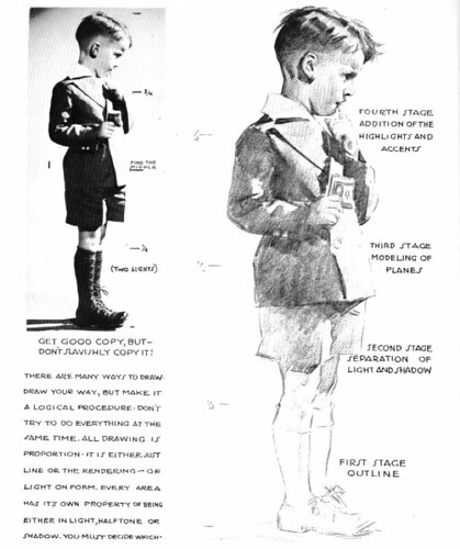
In his book, Fun with a Pencil, published in 1939, Loomis describes proper lighting and the deconstruction of complex shapes in different perspectives. He also explains that a successful drawing must have ten fundamental laws, which he divides into two categories, called the five P's:  Proportion, Placement, Perspective, Planes and Patterns and the five C's: Conception, Construction, Contour, Character and Consistency.

To illustrate, here is a sample page from Creative Illustration that I had pinned up on my wall for many years:

Loomis -CreativeIllustration - page 70

Summary: First draw the subject with line only not using curved lines, but straight lines. Then lightly indicate the shadow line that separates the light and the dark, following the form. Second, fill in the shadow areas with one value. Third, soften the transition between light and dark by modeling the planes, fourth, hightlights and dark accents.

to download online copies of Andrew Loomis's excellent art instruction books, click HERE.

  **********************************************  

Organic Structure Theory

When I took Sadie's oil painting class II, she handed out a print out of this theory of organic structure, which concepts I was vaguely aware but had not realized it encompassed an entire way of thinking about drawing. I have since incorporated Organic Structure concepts into my thinking. The idea is that life is always pushing out, growing, expanding, twisting, curving. This in turn influences the way we think about how muscles fit together, how to draw them, and think about them. The same is true for all organic life. 

Anthony Ryder has a good amount of information for further reading on his website, article found HERE. Also, Ted Seth Jacob's book, Dictionary of the Human Form, documents and explains how the body is a highly organized organic creation with complex interactions using these principles. 

Convex Form
Everything in nature is curved and fluid; nothing is flat and angled unless it is non organic. All organic curves are convex, not concave. If you look closely at a seemingly-concave drape or indentation, you can always see very small convex curves along it.

Everything that is alive is growing, evolving - pushing out. When something is no longer alive, it collapses and pushes back in, creating convex curves in the organic subject. Also, interestingly, the height of these convex curves is rarely, if ever, in the middle - the apex is always offset.
There is more information about curves here:
http://www.cgsociety.org/index.php/CGSFeatures/CGSFeatureSpecial/opposing_curves
and here (this is a great article):
http://www.wetcanvas.com/Articles2/25315/686/

Wide to Narrow/Tapering
Nothing in nature is parallel, every shape starts wide on one end and gets narrow on the other. A shadow shape will always be a fan, not a square or rectangle. Use this concept to "shape the light".

Nothing in organic structure mirrors the other side in a symmetrical manner - ever.  Nature grows and pushes out in a way that creeps along curving asymmetrically. Look at a tree trunk for an example of this. A lot of people will draw that as a straight trunk, but when you look closely at the way it grows, it is a spiraling asymmetrical curve.

Rounding and Ending/Spirals
Every shadow rounds over a curved surface and ends before the next form begins. Every shadow has a soft edge and a hard edge. Think about the direction of the light - generally the edge of a shadow closer to the light source will be soft, and the edge away from the light will be hard.

What's in Front/ Interlocking
The only point on an object not foreshortened is the point directly in front of your eye, everything else is foreshortened. Every form interlocks with another form, overlapping.


 **********************************************   

Gesture Drawing

This method uses a loose gesture with sweeping lines that attempts to find the action or energy of the subject and is not necessarily literal to the subject. The idea is to loosely suggest the overall movement and shapes of the subject. Artists have used gesture for centuries.

Rembrandt van Rijn, Study for St. Jerome Reading,1652

Leonardo da Vinci, Study for the Trivulzio Monument, 1508
(source article here)

The method usually starts with drawing the "line of action" which conveys the over all direction of the pose. Afterwards shapes that represent the head, ribcage and pelvis are hung on the line of action. If the subject is not a figure, the same plan can work by using a line of action to find the main direction of the shape. In my current still life I am painting in Sadie's Advanced Open Studio, I used a line of action to find the direction of the pine cones and then loosely sketched out where the rest of the outer edges of the shape seemed to exist before I found actual angles.

Also, from my own experience in sculpting, we shape our armatures in a gesture of the pose before placing any clay on the form - a critical step that adds to the sense of "life" of the subject when adding structure later. I have even found that the more I exaggerate the armature's gesture, the better sense of movement that sculpture will have in the final results.

Here is a pretty good tutorial for gesture drawing human figures:


 **********************************************   

Caricature

Caricature is a semi-observational method of drawing that intentionally distorts the subject in order to expose that subject's internal character. Some of the earliest caricatures are found in the works of Leonardo da Vinci, however Honoré Daumier (1808–1879, French) is regarded by many to be the grandfather of the art of Caricature.

Here are a few examples of Daumier's political sculptures which he made for himself to use in paintings.


and here is a beautiful drawing, also by Daumier:


Further development in the art of the caricature came with Walt Disney's animated movies and short films, as well as cartoons he published. He employed many artists, famously "the nine old men", who propelled this craft and are still influential to many character artists today. Disney encouraged his artists to study human and animal movement - not to duplicate reality, but to use it as a foundation for convincing fantasy.

"The point must be made clear to the men that our study of the actual is not so that we may be able to accomplish the actual, but so that we may have a basis upon which to go into the fantastic, the unreal, the imaginative - and yet to let it have a foundation of fact, in order that it may more richly possess sincerity and contact with the public. A good many of the men misinterpret the idea of studying the actual motion. They think it is our purpose merely to duplicate these things. This misconception should be cleared up for all. I definitely feel that we cannot do the fantastic things, based on the real, unless we first know the real." 

- Walt Disney to Don Graham, December 23, 1935.

My favorite of the Disney classic films is Pinocchio, released 1940. Below are some great examples of caricature art that was used in the production of that film. These photos are not the greatest. I wanted to post them because they are personal favorites and demonstrate the concept so well. They were taken at the Disney Family Museum in the Presidio, San Francisco. It was not clear who sculpted these maquettes or drew the drawing below.


 **********************************************

Symbolic Drawing

This method departs entirely from reality. The artist uses a series of visual symbols that represent things we are familiar with, like eyes, noses, mouths, body parts, etc. These representations are entirely the creation of the artist. Many cartoonists and comic book artists use this system of drawing.

One of the best examples with historical precedence is Manga, a visual language that has become a tradition in Japanese culture. Artists will memorize established symbols and use them to create their own characters and narratives. Additionally, some artists will use this style as a basis for creating a new style.

"Eye shape and size can be exaggerated or changed altogether. Love-hearts and doe-eyes indicate an infatuation, while stars indicate that the character is star-struck. Spirals indicate confusion or dizziness, while flames or wide empty semicircles indicate that the character is angry or vengeful. When dead, unconscious or stunned, "X"s are sometimes used as an indication of the state. Eyes may be replaced with two "<"s facing in opposite directions to represent a variety of emotions, such as nervousness or excitement. Eyes without pupils and reflective glints indicate a state of delirium." - wikipedia

Naoko Takeuchi's Sailor Moon
 
It makes sense that an art form based on symbols has risen up naturally, given that writing  and language itself are forms of symbolic communication. Likewise, as children, when we first learn to draw, we create symbols of the world around us which are universal. As artists grow from childhood, some begin creating their own visual symbols that characterize their specific expression. Symbolic drawing becomes even more sophisticated as the artist develops ways of getting the viewer to relate to and understand what is being expressed and can become quite refined as in the example above.

 ********************************************** 

Final Thoughts

 If I were to create a spectrum of drawing methods, I would place sight size on one end and symbolic drawing on the other. Methods based on literal realism train the artist to break the internal ideas of how we think we see the world, and symbolic drawing pulls from the internal visual language that artist has developed. Many artists use a combination.

Each is a profound choice in how to see the world, each equally as valid. I find none of these methods lesser or more important than one or the other, rather each way a choice, a different way to see and think based upon the intention of the artist.

My next post is part three of the Advanced Open Studio class with Sadie - open grisaille.

If you made it this far, THANKS for reading! :)

Advanced Open Studio with Sadie/Part Two A

I am breaking up this stage of the process of my still life painting into two separate posts. I am first sharing my technical notes about drawing my set up and Sadie's approach. In the second post, I have done extensive research into many of the various drawing methods available, and I will provide my notes and references for further reading. Even though I have been working as an illustrator and painter, I found it very useful to take the time to read through and understand what methods are available and why an artist might choose one over another, or even use a combination. 

********************************************

First part/ My class notes, The Drawing:

Sadie teaches two methods of drawing, construction and straight line block in. While drawing, I am also taking into consideration concepts of organic structure, which she also teaches (more on this in the second post). The straight line block in method is new to me regarding still life painting, but after having tried it a few times, I have found it a very accurate and useful way of translating what I see on to the 2D surface of the paper.

We draw on heavy grade vellum taped to a few sheets of paper and foam core. All of this of course is on the easel. I assume we are using vellum and not a thinner tracing paper because the vellum holds up to lots of erasing. Pencils need to be razor sharp, and we use an kneaded eraser and "tuff stuff" eraser pencil to erase angles and construction lines as we progress.


It is important to know that this method *does not* use sight size. (more on sight size in the second post) You place the easel close enough so that you can see your subject clearly, being careful not to move too close. If so, you will violate the cone of vision. The cone of vision, 60 degrees in total, is the degree to which your vision can see without distorting on either side. A good way to tell if you are painting too close is to observe whether or not you need to move your head from side to side in order to view the entire set up. If you do, move back until your head can take in the entire set up.

IMG_2486
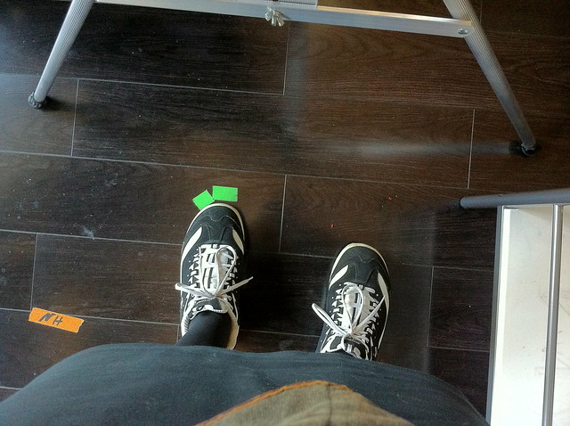
Remember to always work with your feet (or what you are sitting on) taped so you can keep track of your point of view.

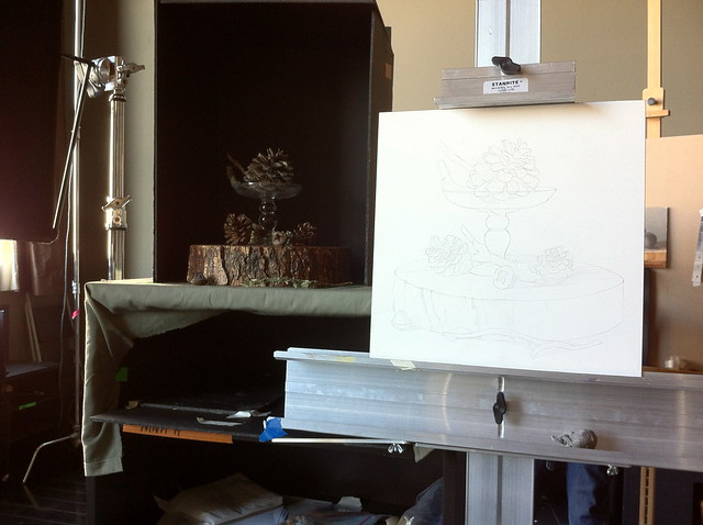
For this still life, I am working about this far away from my set up, about two feet, which is far enough so I can see everything but also close enough so I am able to see small details like highlights and textures:

IMG_2485

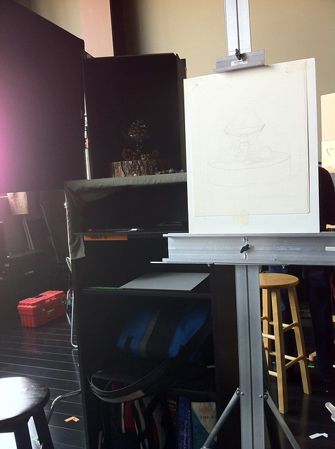
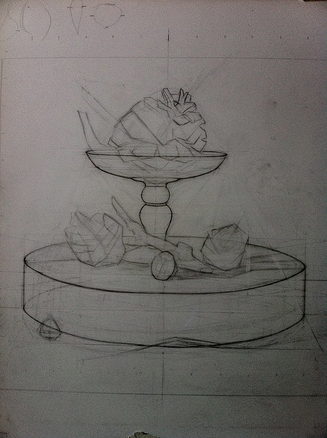
 The first step in drawing the set up is to trace the size of the panel on to the vellum. After that, we began figuring out the general placement of the still life on the paper using angular lines to define all of the outer most edges of the still life, referred to as "the envelope". In the past, when life drawing, I have used this method for placing a figure on the paper or a head if it is a portrait, although I did not realize there was a term for it. The envelope makes sense; there needs to be some way of making the first marks on the paper, and this seems to be the best.

Unfortunately I did not take a photo of this stage, so I have scanned an example of the envelope from Juliette Aristides book, "Lessons in Classical Drawing", page 52. (an excellent book - highly recommended)

The student was drawing an animal skull. I noticed in this drawing Aristides must have had her student first divide the paper into halves, making plumb lines in order to find the center. I have also found this very useful in the first steps when trying to place a complex object on to the paper, especially when there are several objects in a still life. I don't tend to use this for life drawing, although I imagine it would be helpful.

After figuring out the first lines I progressed from there to find the placement of each object. I found that it was helpful to use a gesture of each object and lightly draw in where I thought it might be. After that, I checked the placement by holding up a knitting needle to find the angles of a particular object  and noting that on my drawing. I also noted where the bottom of that angle hit another object. By doing this over and over, I eventually found the placement of each item in relation to each other.


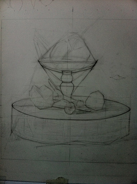
Here you can see several construction lines, although many were erased at this point.
IMG_2483
My photo is a bit dark. In order to record this light drawing with the camera, I needed to darken the photo a bit, especially since it is on vellum.

At this point, instead of drawing with the straight line block in, Sadie instructed that I construct the glass pedestal symmetrically, and also the large wood tree slice that I am using as a base. To do this, I took my drawing off of my easel got out my t-square.

This step is quite revolutionary to me, and different from anything I have learned in the past about painting from life - construction. While I have worked in the animation industry and as an illustrator in gaming, I have always used construction methods to compose drawings, but I have never used it for observational painting. In the past, I simply blocked in shapes with straight lines and shadow shapes before painting. After having tried construction in this way, I've realized it is an incredibly necessary way of composing man made objects in any still life.

Using my t-square, I made a box around the top of the glass pedestal, and found the exact shape of the ellipse.I also found an ellipse for the bottom wood base. Even though it is an organic object, Sadie said that it would be helpful to draw it as a true ellipse first, and afterward add the asymmetry and variation where I observed it. Here is a good tutorial for how to draw an ellipse.

In all, I spent about five hours or so drawing out my still life using the methods described above - I assume that as I absorb these methods I will be able to work a bit faster. I only took the drawing to about this level, below, finding important key points before I transferred the drawing on to the panel.

IMG_2491

Before I transferred the drawing to the panel, Sadie informed me there was too much texture on the surface of the panel. It looked as if a machine had sprayed on the gesso, which is probably the case. (I am using a brand called gessoboard, which is widely available in art supply stores) To get rid of the texture, Sadie had me wet sand the surface with a high grade sand paper with a little turpentine. I worked in a circular motion in small areas until I got a paste, and then wiped that clean from the surface. After an area was finished, I started another area.
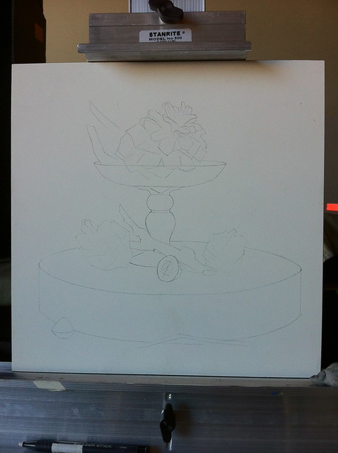
To transfer the drawing, I used Saral brand wax-free transfer paper, taping my drawing on the vellum to the panel.

IMG_2529
my drawing on the panel after the transfer

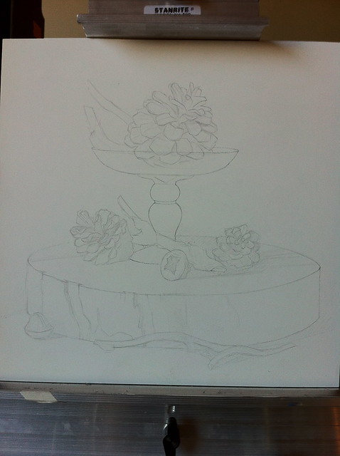
After the drawing was transferred, I worked a bit longer, drawing in all the details of each pine cone, making minor adjustments, and refining the entire drawing before varnishing it.
IMG_2531

The drawing is then sealed with varnish. The varnish mixture Sadie uses is:


1 Part Dammar Varnish
1 Part Odorless Mineral Spirits


Shake jar gently to mix. Apply a thin coat to drawing using a clean make up wedge, which you can purchase at Walgreens. Remove any lint while varnish is wet by picking up debris with the flick of a corner of the brush. Don't over brush - it soon becomes tacky. Apply only one coat and allow to dry overnight, leaving a full 24 hours to dry. 

********************************************


Stay tuned for part two! Thanks for reading!
Advanced Open Studio With Sadie/Part One

For the past several Sundays, I have been working on a painting during Sadie J Valeri's advanced still life painting course. I have taken Sadie's oil painting course in the past, which I wrote about HERE. This time, I was interested in moving forward with a subject of my own choosing and practicing the Classical Realism techniques I learned in the first course. The Advanced Open Studio takes place all day on several consecutive Sundays. I will break up what I am learning into several blog posts as I go along in the course. 

Feel free to leave comments if you have any questions. I will do my best to find the answer and share what I've learned so far. :)

 ******************************************************************************

 Notes

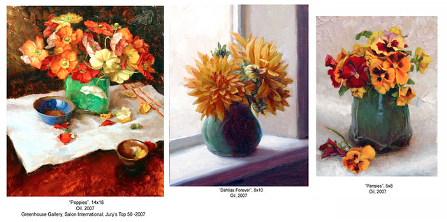
 When painting still life subjects in the past,  I have simply set up an adjustable table, arranged some things I liked, and then lit it all with either a north window or a spot light and painted in the alla prima manner. Here are a couple of examples of paintings I did in the past. 

Lundman_old paintings

The problems and questions I encountered working on my own were numerous. I did not seem to be able to find the answers to my questions anywhere other than within the classical realist school of painting. Fortunately, Sadie J. Valeri's Atelier is literally right down the street from where I work and live - what an incredible opportunity to expand my knowledge base and develop my work further!
Some of the problems I ran across in my still life paintings were:
  1. how close to the set up should I be in order to approximate life size? In the past, occasionally I would set up a still life, tape up some canvas on my art board, spend hours drawing everything out and then realize afterwards I drew everything too large. Why was I was making this mistake and sometimes not?
  2. Sight size or construction? What is the difference and where do I fall in the debate? How can I ensure accuracy?
  3.  how can I achieve dramatic lighting? North light is ideal of course, but sometimes I want drama in my still life paintings. Just placing a spot light seemed like it wasn't getting the effect I wanted. I was curious to know what I could do to manipulate the light.
  4.  basic equipment. Believe me, as simple as it sounds to set up a still life, I have tried so many options for equipment.What is a good set up that I can work with for the long term and add to it as my interests grow?
  5. am I truly understanding how light moves across a surface? How does the light affect chroma, hue and value in each area? How can I be more deliberate in my color choices?
  6. Which do I want to emphasize, value or color?
  7.  Perspective. I often wondered about how perspective was affecting my still life, and how to control it. When working, it is impossible to keep your eyes and body at exactly the same location, which alters the point of view. How can the point of view be controlled in the final painting?
  8.  which method of painting suits my temperament? There are a few schools of thought and approaches to painting. Which one seems right for me?
  9.  What do I want to say? Perhaps the most important question of them all.

  Part One/ Equipment

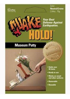
 To secure the objects in my set up, I used Quake Hold Museum Putty. The putty is like chewing gum, but with less chew. It will hold just about anything in place. Highly recommended for keeping your subjects secure while working on a long term painting.

quake hold
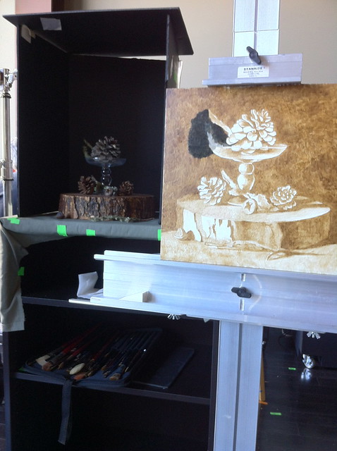
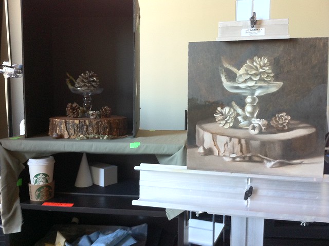
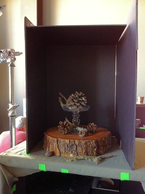
At Sadie's Atelier, we place our still life subject in a shadowbox. The shadowbox is composed of three sheets of black foam core, taped with black tape on all sides (I hadn't taped up the sides yet in this photo). To the left of my set up is a HUGE North light window which provides consistent lighting but is a bit too strong, washing everything out. The shadowbox controls the light to exactly the effect I want, without having to worry about too much bounce light coming from another direction. In the future I plan to experiment with different backdrops using colored paper or cloth inside the walls of the shadowbox.

IMG_2553

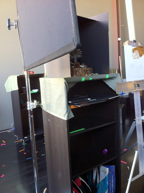
To control the light even further and get REALLY nice light effects, Sadie set up a photographers flag. I have found it revolutionary; moving the flag back and forth allows light to come into my still life area a little at a time, creating exactly the effect I want.
IMG_2552
The photographers flag comes separately and needs to be attached to a stand, which also can be purchased at a photography supply store.

The shadowbox and still life sits on top of a tall black stand while my supplies sit on the bottom shelves. If I would like to change the point of view, I can paint a new set up on a different shelf while having a built in shadowbox to maintain the light.

IMG_2548
Ikea shelf unit:
Besta Shelf Unit
Also use these caster wheels, they are made to attach to the bottom of the shelf unit:
$10 for 2/pk
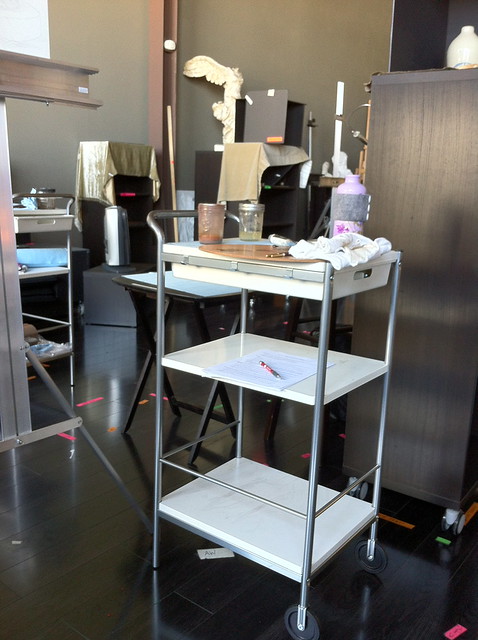
To my right is a table for my supplies. The table simply holds the supplies I am using during the session, like my pencils, sandpaper, my notes, paints and mediums. Sadie keeps a shop cloth on top to keep the table clean. Usually I store only what I need on the top level and keep the rest in the black shelving unit that the still life sits on. I don't like to have too many things out all at the same time. If I do, my table becomes cluttered which ends up distracting me from the task at hand on the painting.

IMG_2550
this side table to hold my supplies stands about waist high, which is nice so I don't have to keep reaching down too far to get my supplies. 

The easel I use is at eye level height. It is a simple Stanrite metal easel. I like using this lightweight easel because the top and bottom bars that hold your panel have grooves, which secure a thin panel. The grooves are a minor but important detail that make a big difference; I no longer need to worry about my panel shaking while I work or become distracted momentarily by having to tighten the top bar to tighten the hold on the panel.
IMG_2533 
The sturdy, lightweight, and economical stanright easel. 
 
When working on a painting, it is also important to tape your position. You want to remember the point of view you are painting from. If you move a little to the left or right each time, you are not observing the specific situation. Taping your feet or chair is a good way to keep track of your spot. It is not necessary to tape the easel. What's important here is keeping track of where your eyes are viewing the subject.

IMG_2547 
taped feet. the easel can move around a bit but not your body, which should be in about the same place each session so you are painting the same point of view each time.

In the next post, I will share my notes about the drawing stage and the questions I tried to answer. Onward!

"All men dream: but not equally. Those who dream by night in the dusty recesses of their minds wake in the day to find that it was vanity: but the dreamers of the day are dangerous men, for they may act their dream with open eyes, to make it possible." ~T.E. Lawrence