A different take on fairies

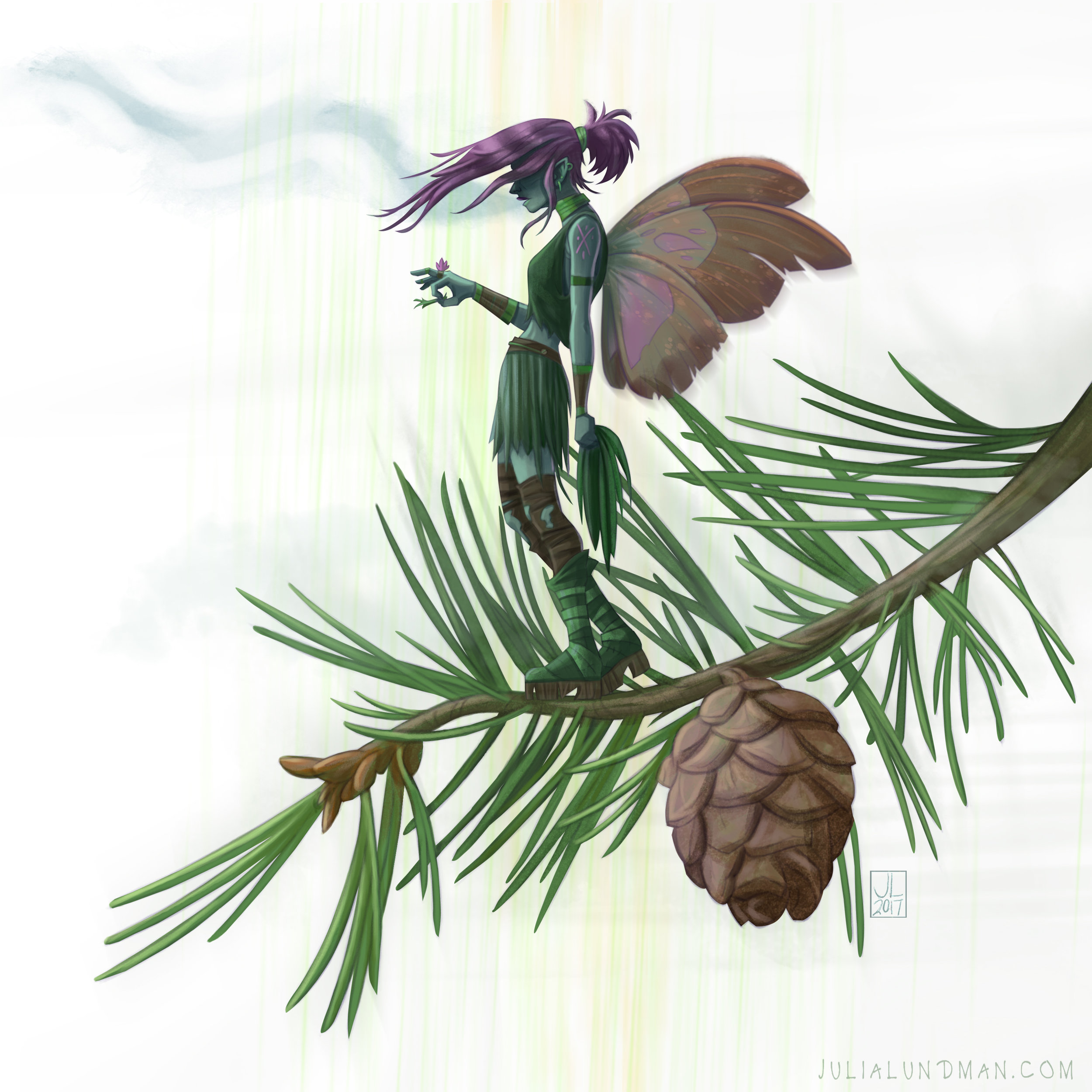
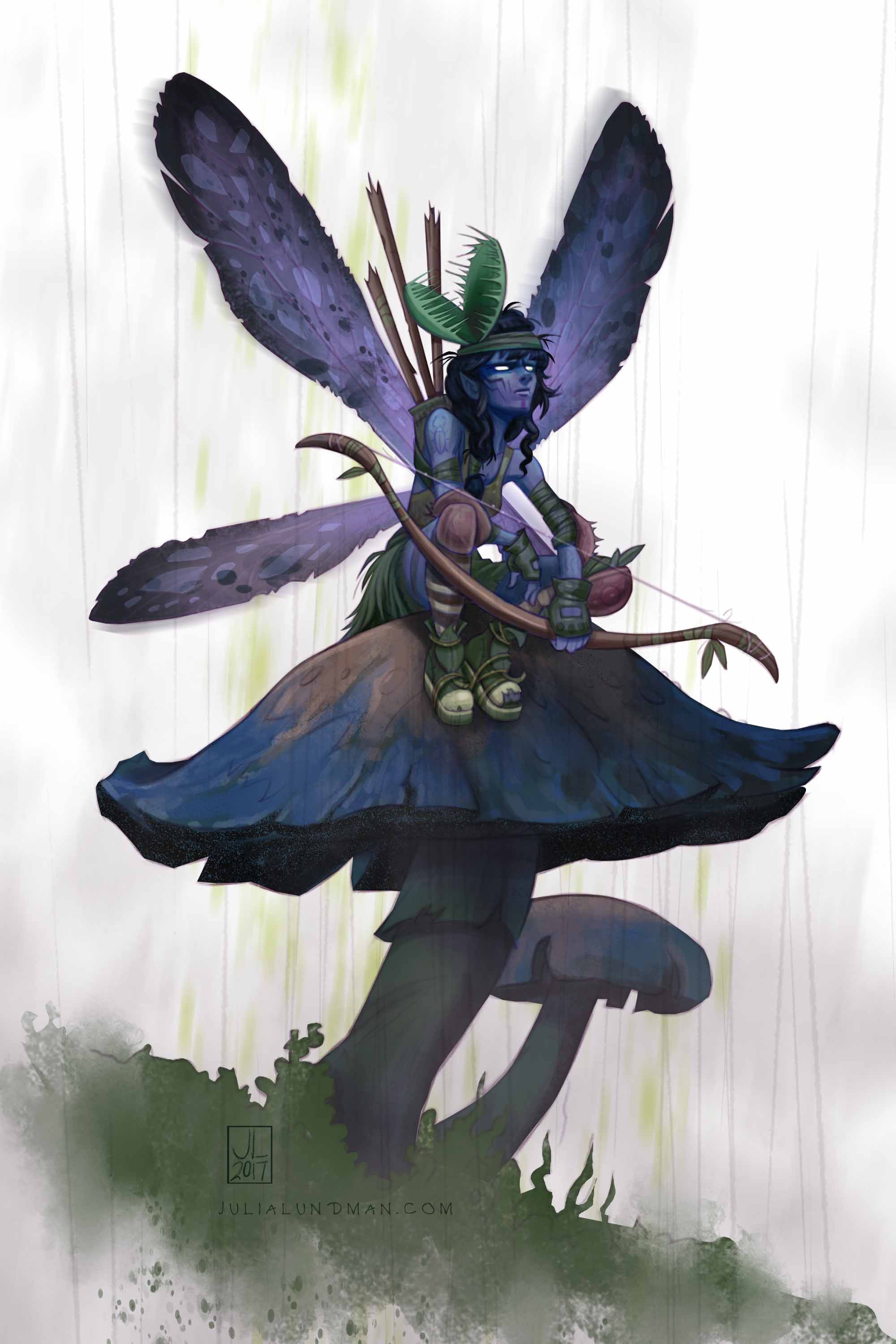
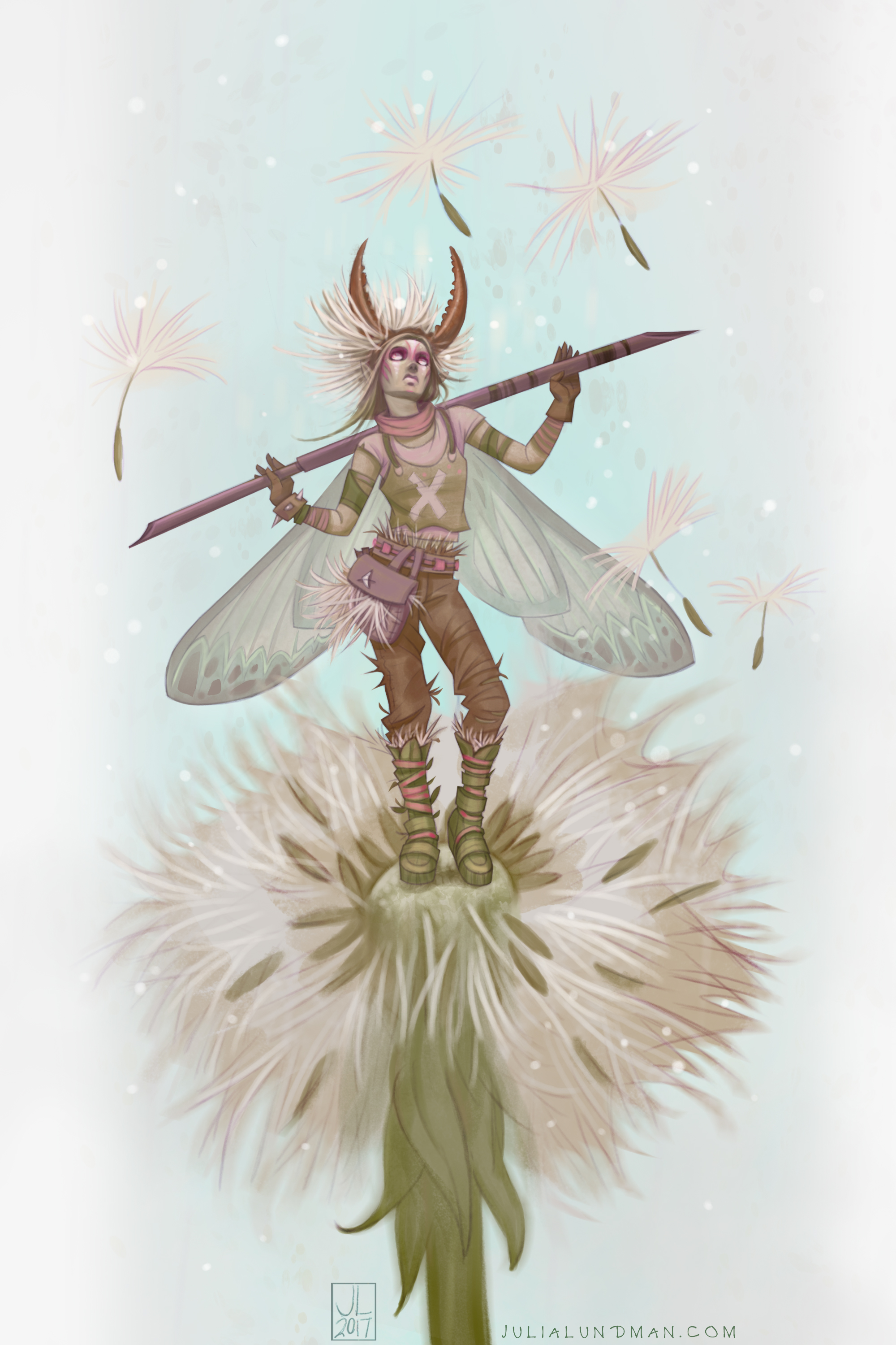
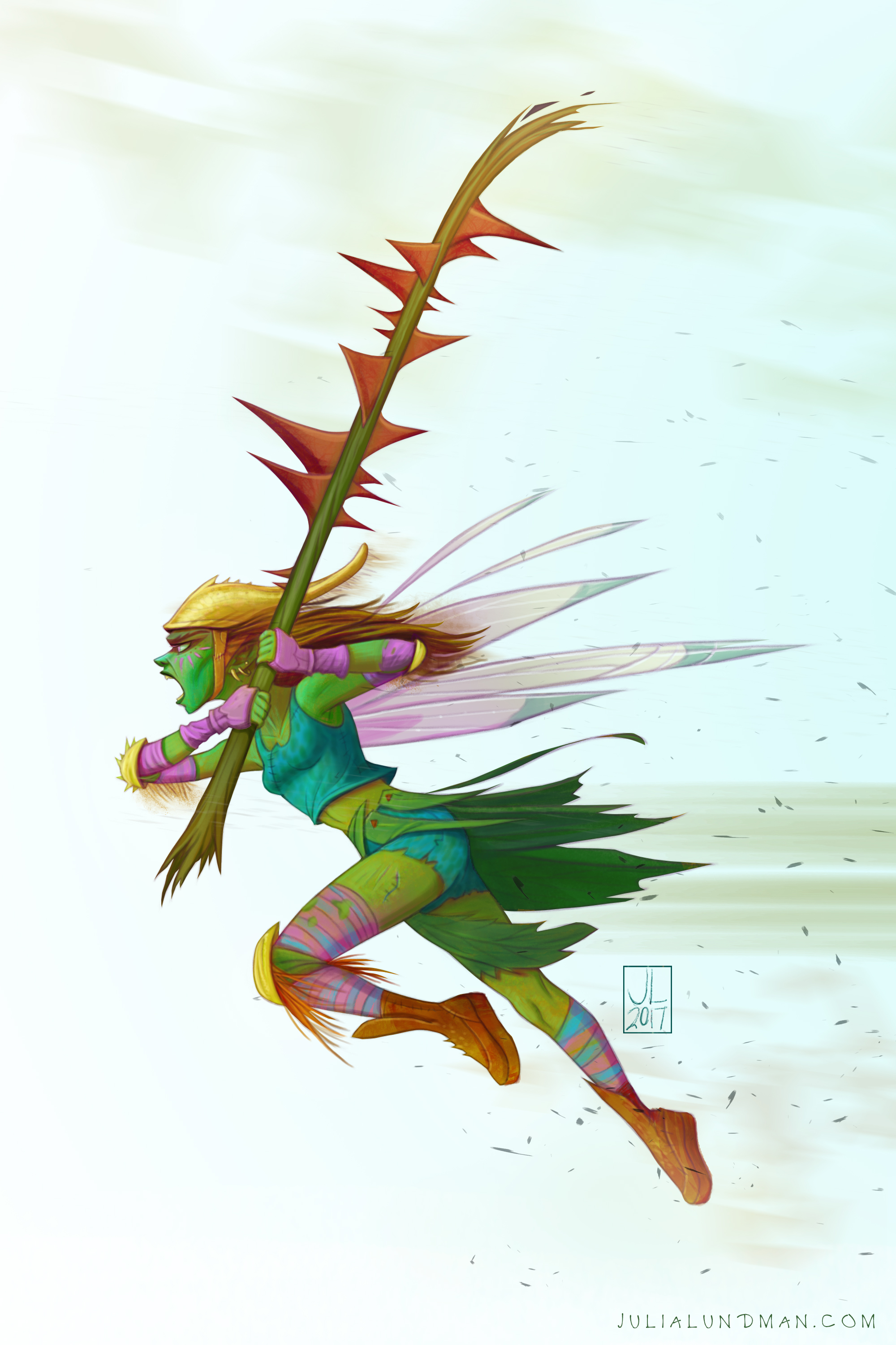
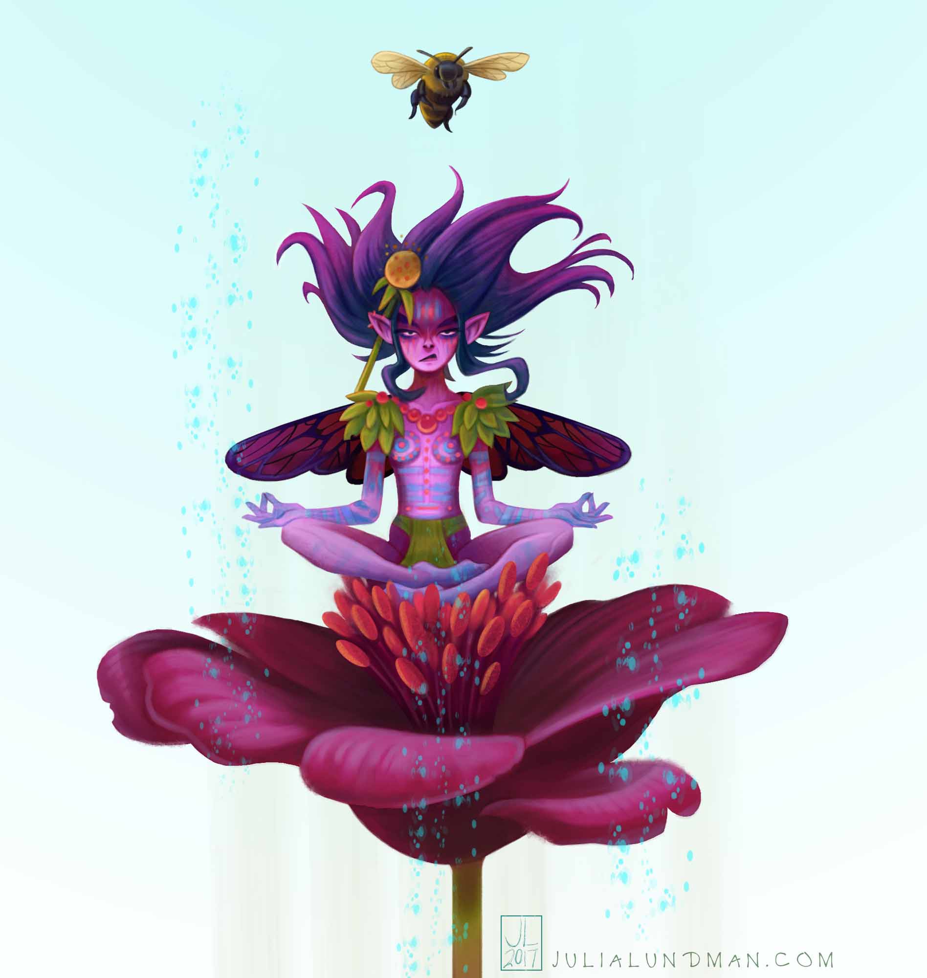
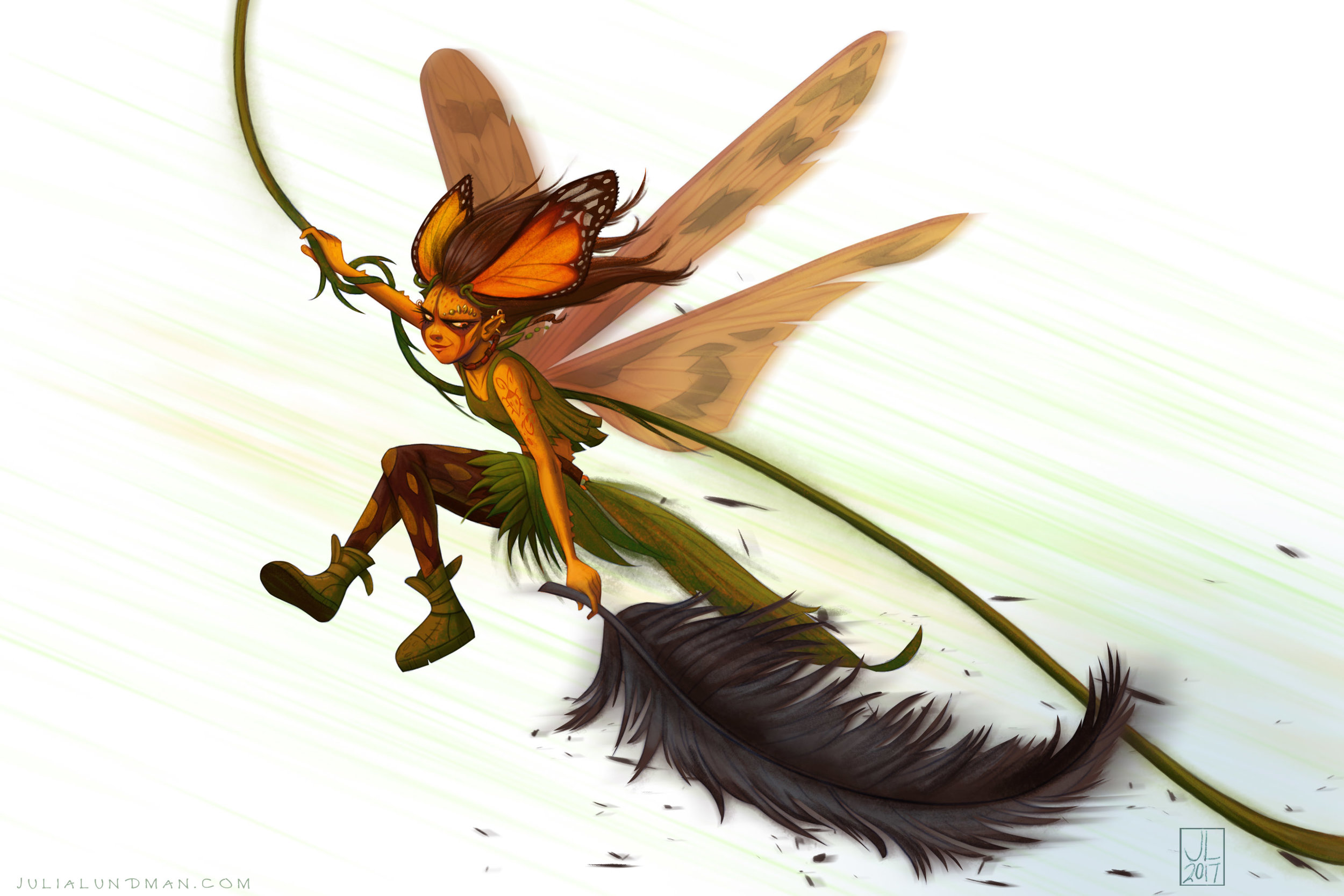
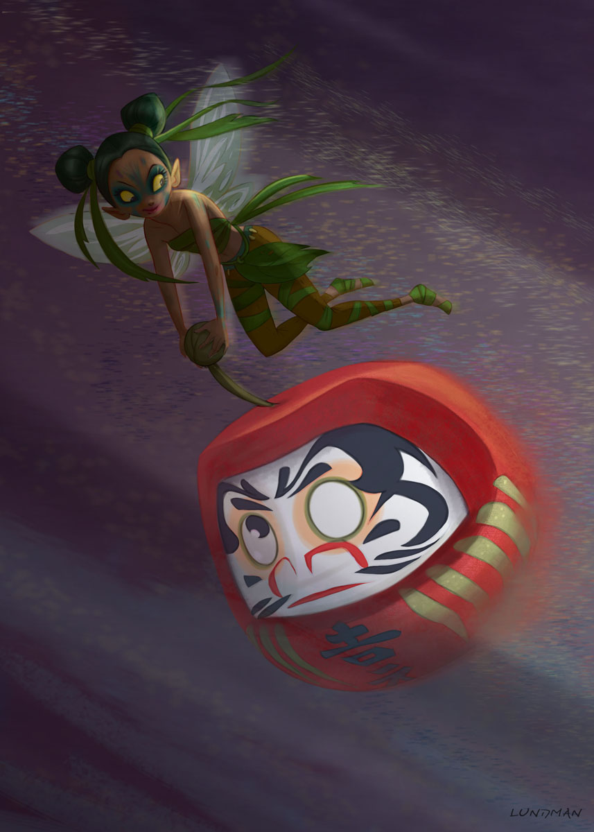
I tend to draw a lot of fairies in my sketchbooks and elsewhere for fun. Earlier this year I had an idea about fairies as young women full of angst.

To make them relatable, I decided they would not have more extreme creature-like designs, rather, they would be simply tiny humans with wings. I spent time working on acting, posing, anatomy, slight stylization, and themes. I also created a simple rule, that the backgrounds would always be white and that they could have one natural element or prop.

The goal was to create a series of images that had a similar attitude while all being different. The summer is over now and I have other projects in the works, but I may design a few more before the end of the year. They are really fun to work out! 

Little Golden Books/Disney's Palace Pets!

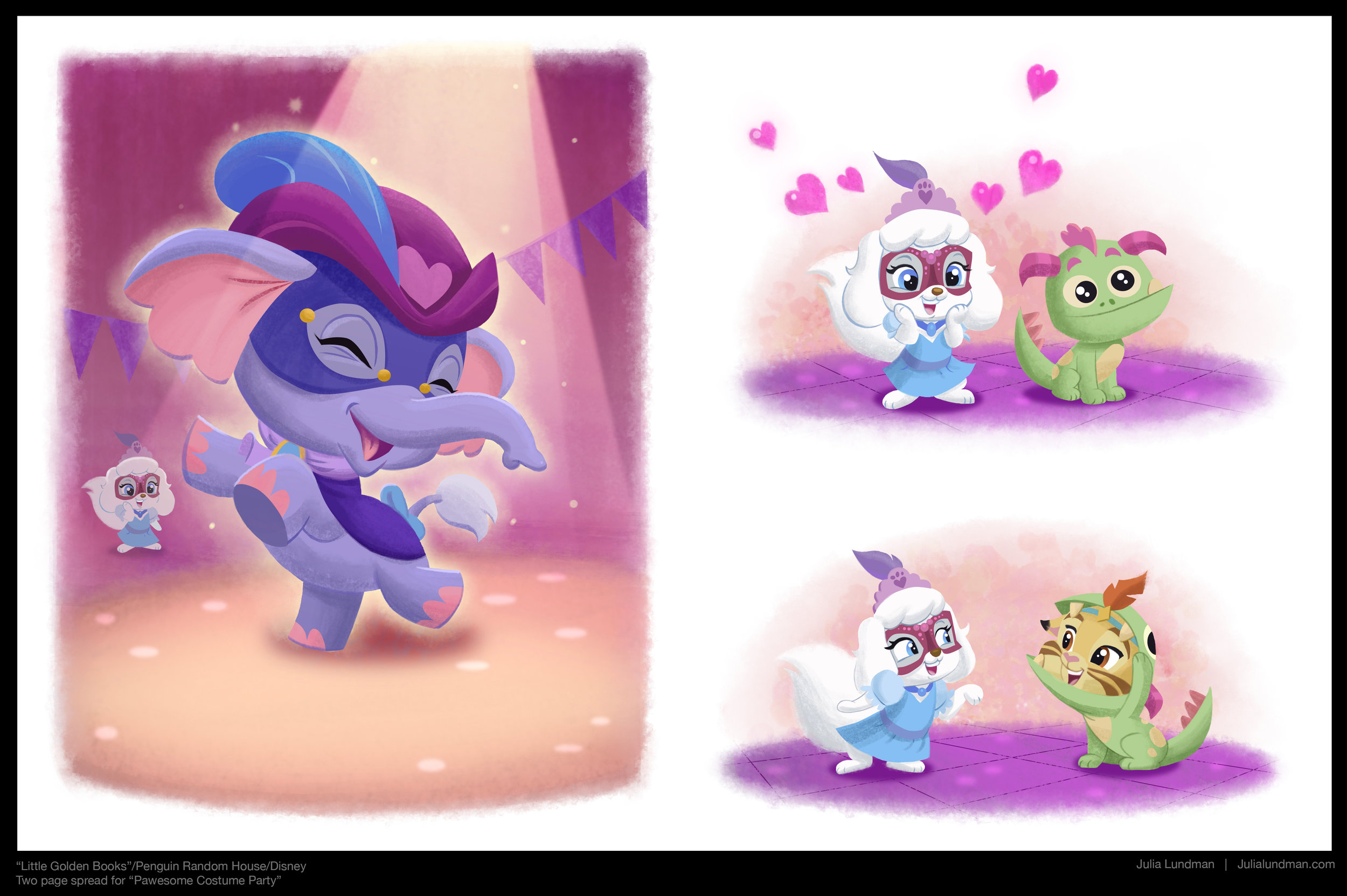
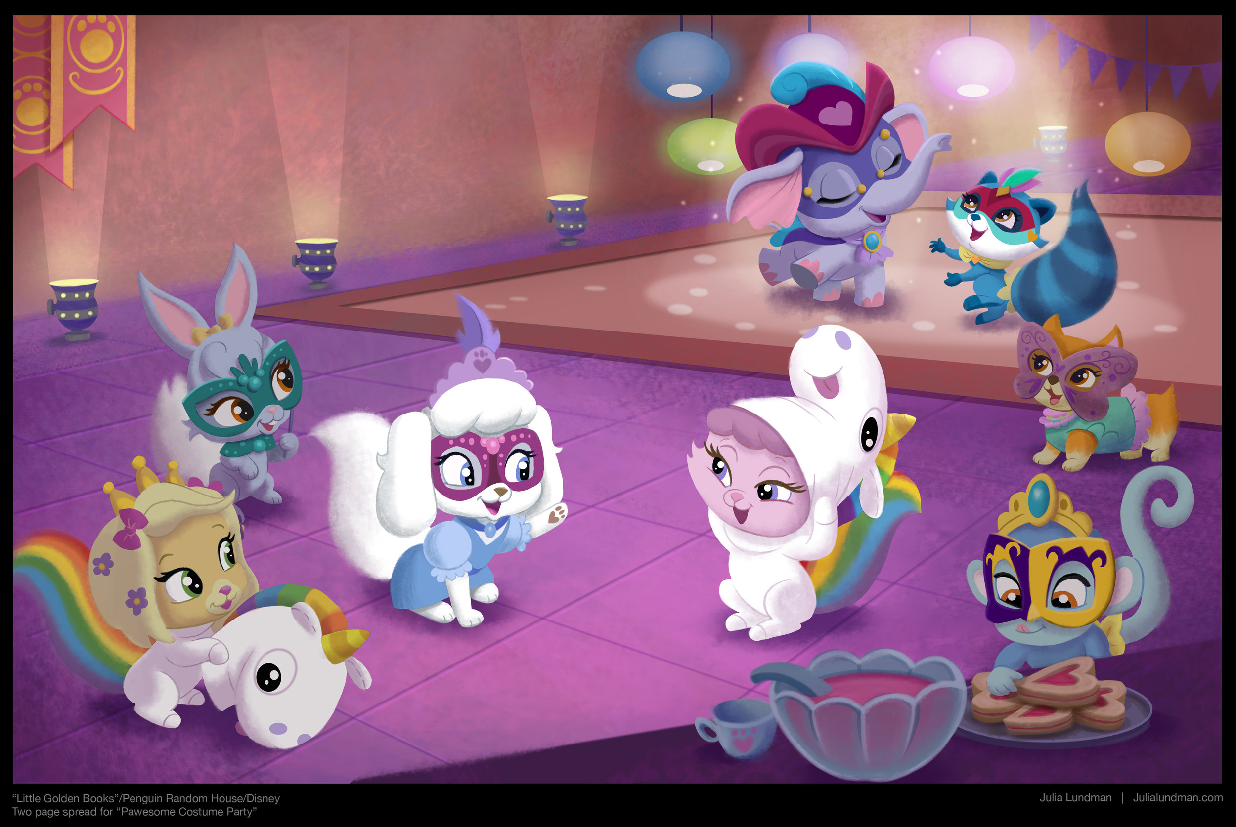
I was so excited earlier this year because I had the opportunity to illustrate a Whisker Haven Tales "Little Golden Book"! I'm STILL excited about it now that the work is finished, too! I love Disney's Palace Pets and the world we've worked so hard to create for them in the animated shows. 

On the animated show, I have been responsible for designing the environments and color palettes at Ghostbot, where they are produced and directed by the talented bots. The "Little Golden Book" I illustrated was based on the episode, "Masquerade Ball". It was so thrilling to translate the animated short into book illustrations. Painting everything to the nine's was super fun and definitely a learning experience that I hope to try again someday!

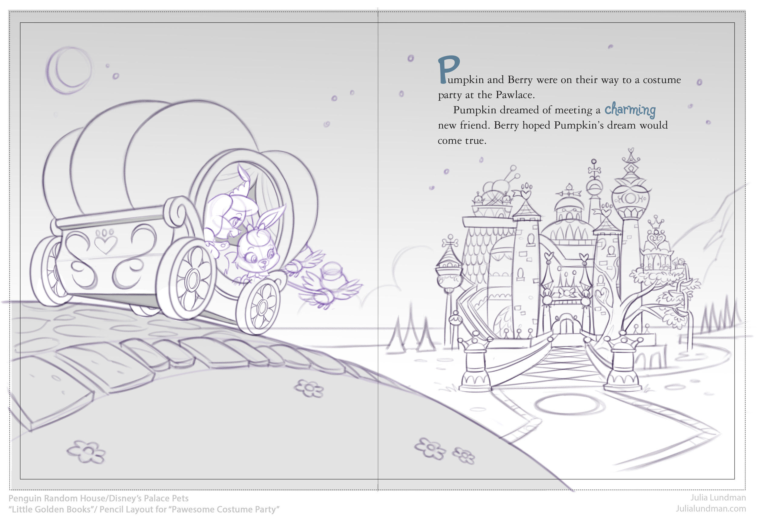
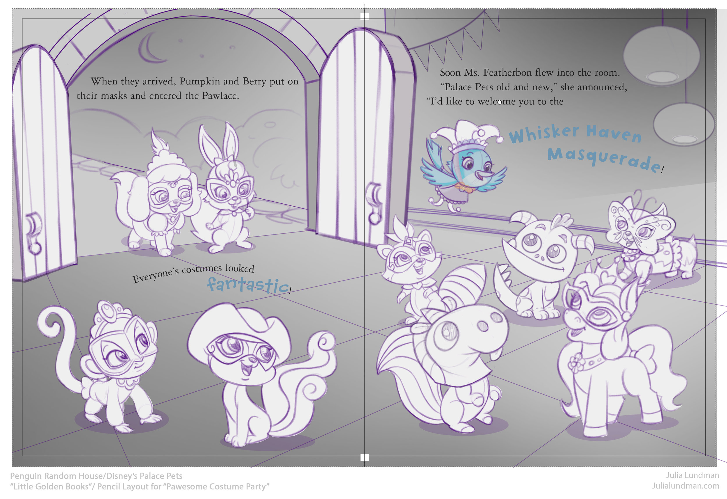
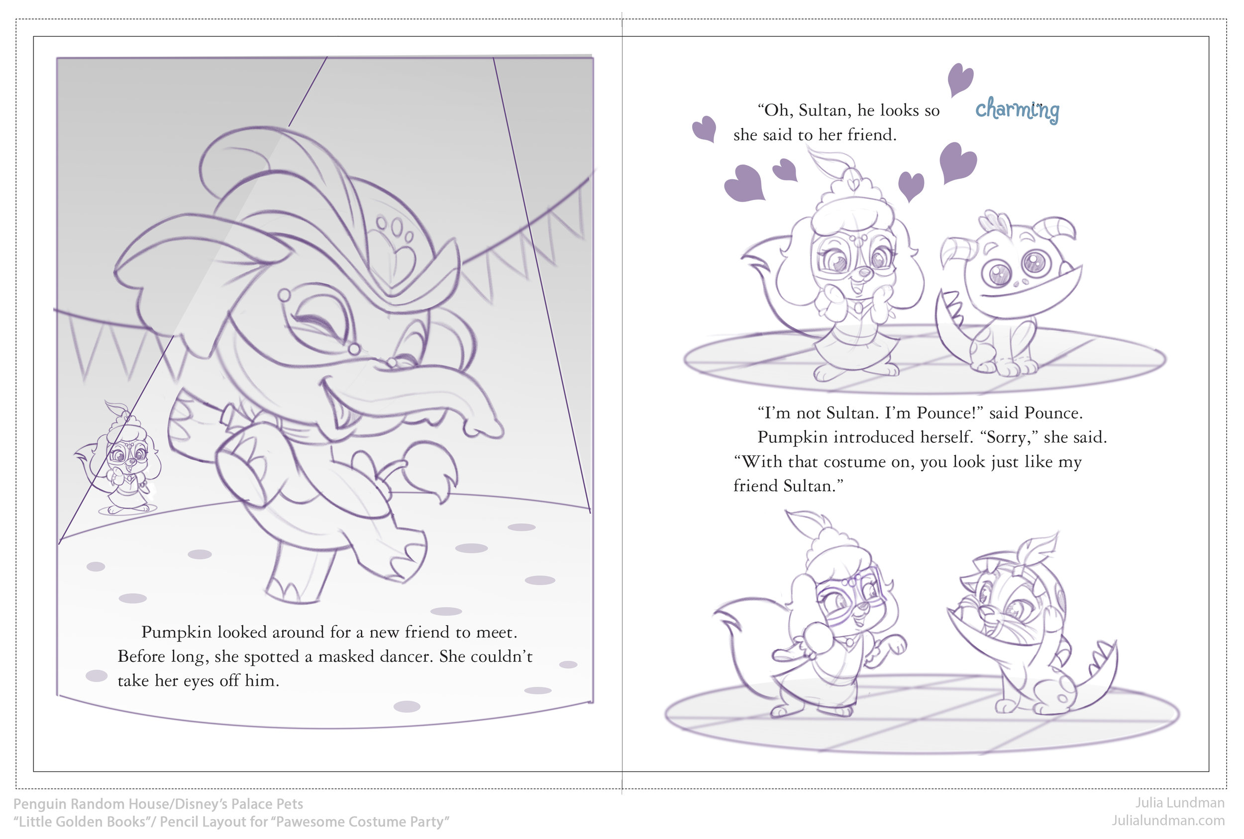
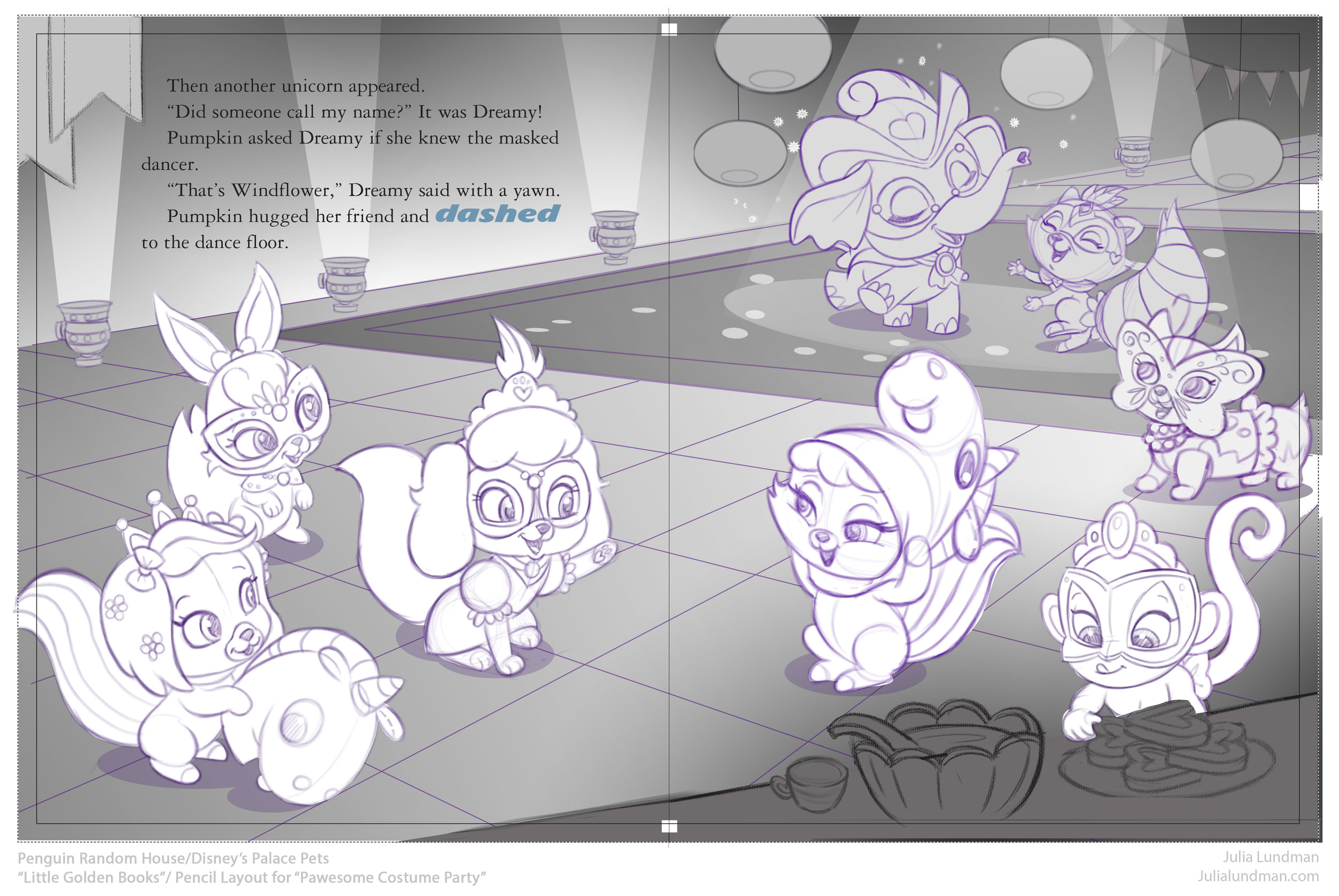
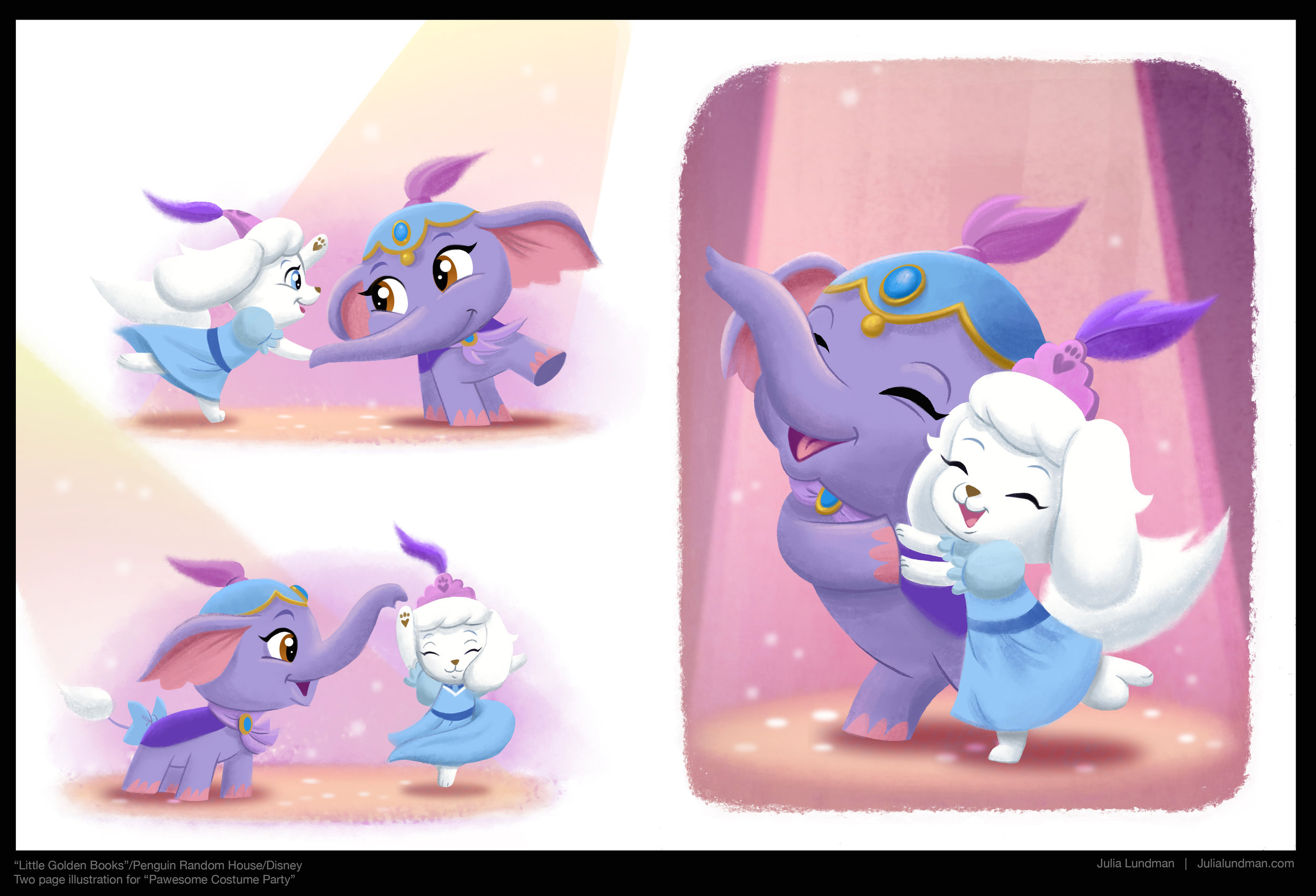
The process involved working up pencils for the entire book. Here are a few samples:

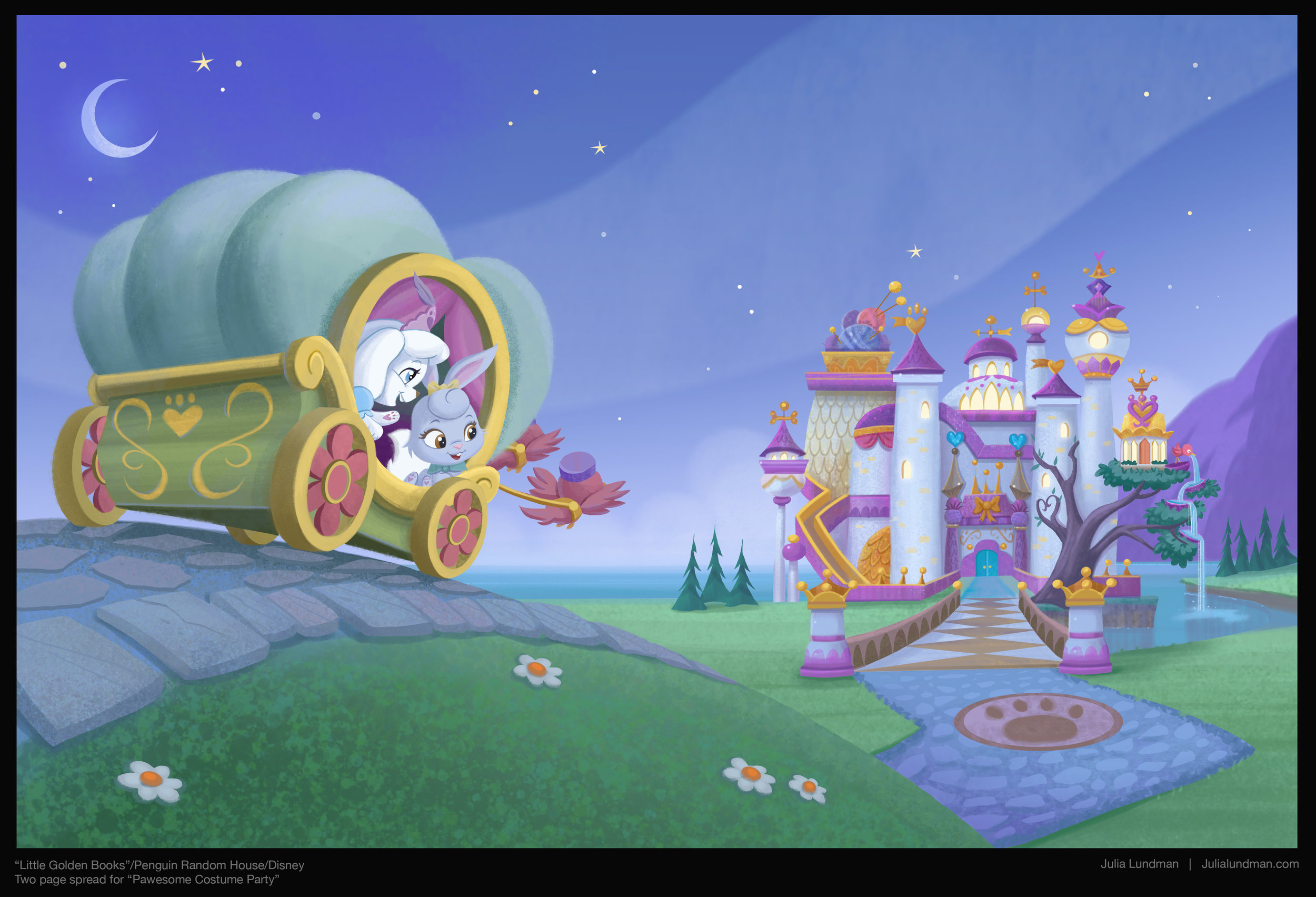
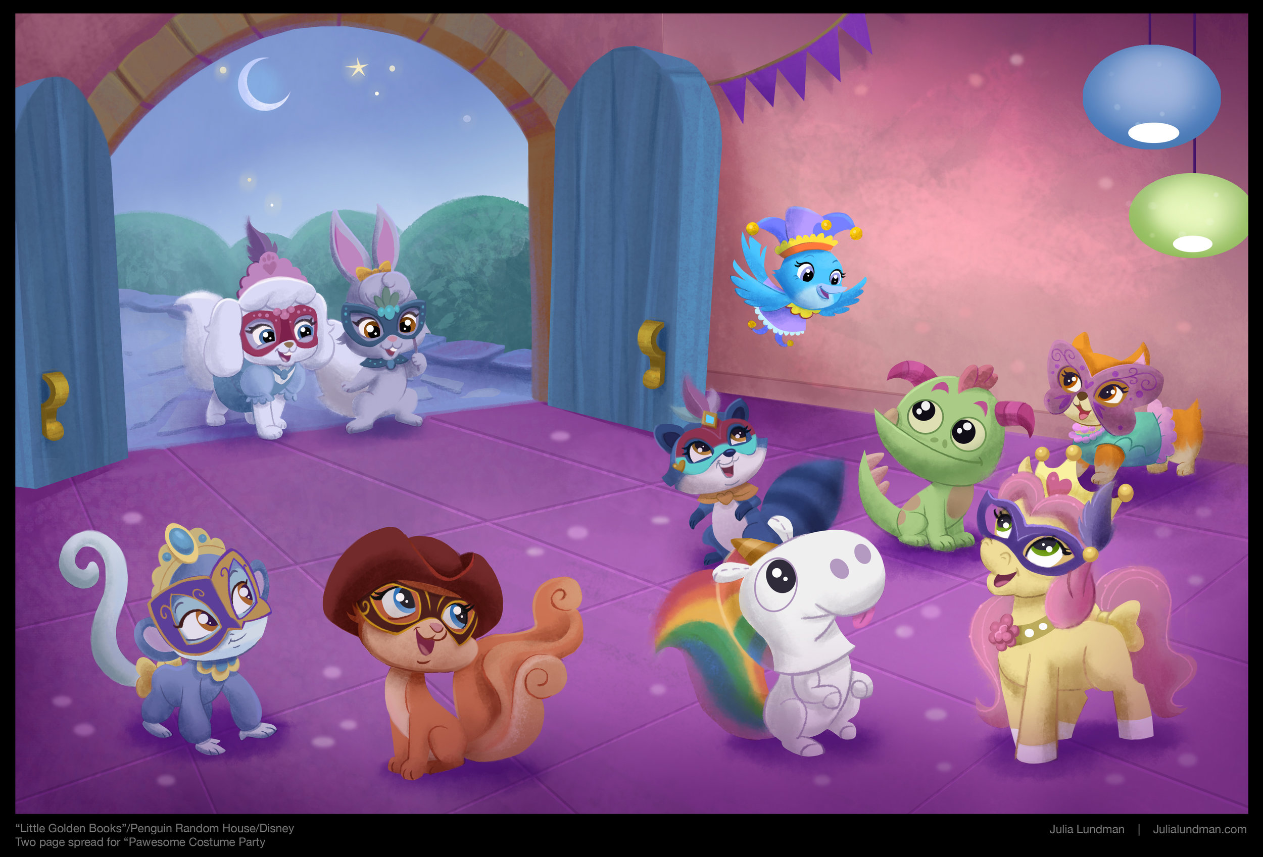
And after the pencils were approved by both Random House and Disney, I moved ahead with full color. The fun part! I could hardly wait for this stage, where I got to experiment with brushes in Photoshop to get the texture I was looking for. If I ever get to illustrate another book, I would like to push it even further. 

Look for "Pawesome Costume Party" with the Palace Pets from Random House "Little Golden Books" coming soon! 

Spectrum Entries, 2017

Like a lot of artists, every year I submit a few images to be considered for entry into the Spectrum annual illustration book. Like a lot of artist, I have yet to get into the book. The book is a badge of honor in the art world, and so it is worth trying. This year I decided to enter this small series of paintings I did, all digital, of fairies I painted last year. My fairy series always come out of sketchbook musings and aren't necessarily attached to any particular project, just a bit of whimsy.

Here are my entries. Here's to hoping I get in! 

"Fairy Tea Party", Photoshop

"Fairy Tea Party", Photoshop

"Daruma Thief", Photoshop

"Daruma Thief", Photoshop

"Bee Rider", Photoshop

"Bee Rider", Photoshop

The Little Mermaid, A different take

I recently saw some online images of the Finnish ballet of Hans Christian Andersen's, "The Little Mermaid" and was totally floored. Everything from the costume design to the lighting and dance have a slightly dark and mysterious tone that feel just right for the classic tale, departing completely from the Disney version. It made me wonder what other cultures and takes on the tale might be interesting to see. I was inspired by the architecture of Okinawa and thought perhaps the Little Mermaid might fall in love with a Samurai. I'm not sure I really got it but it was seriously a blast to dream about.

Some initial thumbnails, dreaming about what kind of island The Little Mermaid first encounters the Samurai.

This is an establishing shot of the island I chose from the thumbnails, just before The Little Mermaid meets the Samurai she falls in love with.

I was thinking of some foreshadowing in the architectural motifs. These are a few ideas. The possibilities are endless, really. Below are a few variations on The Little Mermaid. I still feel like I want to do a few more pages of these and then move on to the Samurai, Triton and the Sea Witch.

Many more updates coming in a few weeks! Thanks for visiting.

Bee Rider

"Bee Rider", photoshop

A few years ago I had this idea that tiny humans with wings were discovered in various regions of the planet. It's not a new idea at all, but I wanted to mess around with making these fairies a sort of tribal, pagan warrior race that looked more human than the wide-eyed alien version. I am deeply inspired by the art of Mary Cicely Barker (of Flower Fairy fame) and Margaret Tarrant , Edwardian era artists that depicted tiny human-like fairies usually of a friendly beautiful sort. 

Margaret Tarrant watercolor

Cicely Mary Barker watercolor

I wanted to take their ideas about fairies and focus on aspects of character personality and group culture. It's a pretty big project that I am picking away at here and there in between many other projects. 

I did this quick little sketch about five years ago. I like the idea but it's a little too vertical for the kinetics of the scene, and the costume doesn't work for me. I wanted to explore warriors that are more gutsy and brutal instead of sweet. I scanned my sketch and then did a TON of loose drawings on top to work out the idea more to my liking. 

I also did a few studies of bees. Here are a few sketches. I thought about stylizing the shapes and the character far more than this, but in the end decided I'd rather focus on the story of the character, and of course (since I love to paint) the light.

I have a several more warrior fairies in the works in various states of finish. Hopefully I'll post a few more this year in between other posts. :)  Thanks for reading!

Disney's "Whisker Haven Tales with the Palace Pets", Season 2!


For the past year or so I've been working on a new web and tv series called, Disney's "Whisker Haven Tales with the Palace Pets", published on the Disney Junior website and network. The latest episode, "Chowing Down" (Season 2), can be seen here:


All of these shows are developed, directed and produced at the awesome Ghostbot animation studio, where I have been working as Art Director with the Director-bots, Alan, Roque and Brad.

I am SO, SO proud of the really hard work that we all have done on this series. The best part has been meeting kids that tell me all about the shows and the characters. There is nothing better than that!


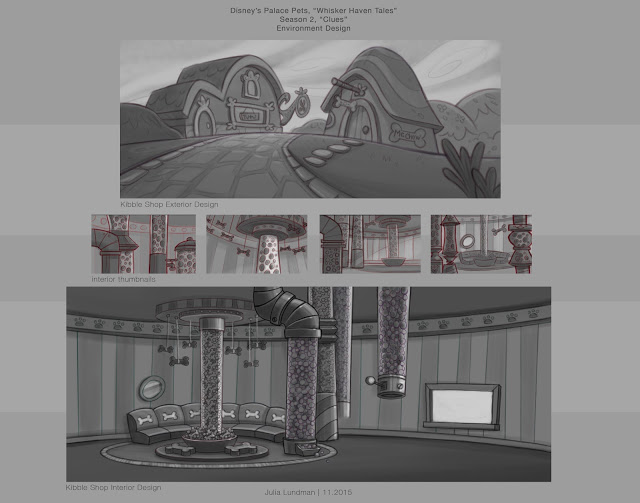
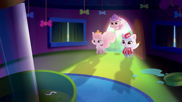
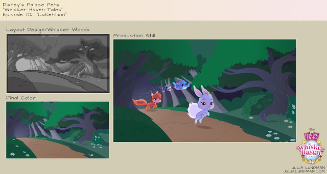
Here are a few production stills from this episode (I think this one is my favorite!), directed by Alan Lau. The color script on this episode was really key in getting the lighting, mood and tone just right, and also making sure transitions worked from the first sequence which was the set up to the indoor Kibble shop and dream sequences. 


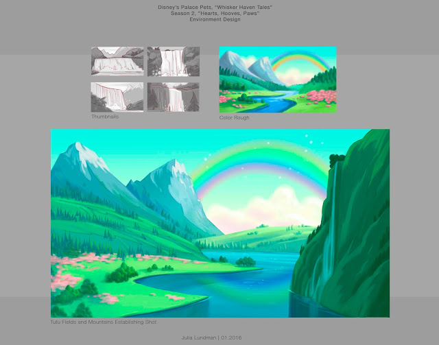
Below is some of the design work I did for the spring episode, "Hearts, Hooves, Eggs!", directed by Roque Ballesteros. The biggest thing I learned in this episode was scaling of details in the distance vs. the scale of details in the foreground. I spent a lot of time looking at mountainscapes studying how to make them work atmospherically.


The color script for the "Masquerade Ball", directed by Roque Ballesteros, was one of my favorites. The episode practically designed itself! A dark room with a party atmosphere was pretty interesting to explore in the color script and in the background design. I was surprised at how dark it could go, actually, and still read as long as the main characters had a good amount of light on them. 


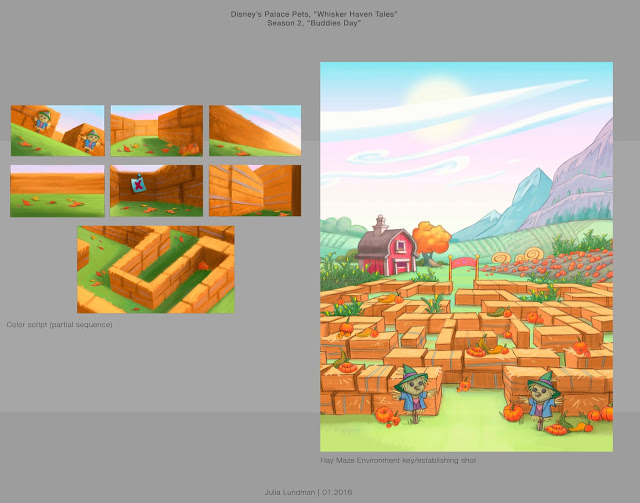
"Buddies Day", directed by Brad Rau, was really fun to design since the fall season was a character in the episode. I thought about things like how the color of the grass and the position of the sun in the sky would be different and distinct from episodes that take place in the summer or spring months. The most difficult part was the lighting in the maze from shot to shot, which required a color script - absolutely. In addition to that, getting a hay texture and shape in flash without it becoming too distracting or vector-y looking against the action of the characters was a real challenge. In the end, I think we found a good balance after a lot of trial and error. 


I just wrapped on Season 2, 13 episodes, which will be released throughout the year including a Christmas episode I'm really excited about. I'm really hoping that we get a 3rd season. After 23 3 minute episodes I feel like I've really gotten to know the world pretty well. I enjoy every single part of the storytelling process in animation and film making and especially working with the Bots. I hope to visit the world of Whisker Haven again sometime soon! 

2016

Being a Capricorn, I have always been driven to succeed. It is frustrating to me that even with all my heart and intentions, I have yet to complete some of the many goals I set out to complete way back in my 20's. There are, of course, many complicated life reasons for this. 

This year I've decided that no matter what, I will accomplish a few of my big art goals, no matter what. 

Seven times fall, eight times stand up. 

I did an alternate, darker version of this painting as well. I can't decide which I like better. 

Happy New Year 2016!

Star Wars Comps for Concept

Earlier this year for a class assignment with Armand Baltazar at the Animation Collaborative, we had an assignment to come up with a scene or concept that currently does not exist in a movie. One of my all time favorite movies is, of course, Star Wars, the original trilogy, but most especially "The Empire Strikes Back", where we meet Darth Sidious, "The Emperor", for the first time. 

Up until that point, we feel that Darth Vader is the most powerful guy in the universe, even though we are conscious that he is definitely working for someone. When we meet The Emperor, he seems to be parallel to Master Yoda in power but belongs to the Sith and rules the Empire. However, I had always thought that since Darth Vader has unusual power, the Emperor, being a completely corrupt man, would perhaps have some other way of gaining force power than just by being himself. In addition to that, he must have been extremely peeved when Vader let Luke get away. 

I imagined that in between "The Empire Strikes Back" and "Return of the Jedi", Darth Sidious brings Vader into his private chambers where he keeps a gigantic symbiotic parasite that he uses to not only control Vader, but also torture him and secretly extract force energy from him.

Here are a few concepts. I will bring one of these to full color soon, hopefully in the new year!


Additionally, I sculpted a bust and draped some cloth over him to create a nice working model of the Emperor's face. I've wanted to do a portrait painting of the man, and this will be very helpful for lighting. 


"LOSING TIME", Poster Roughs

This year I have been very busy writing and rewriting, and then rewriting again the story for a graphic novel tentatively titled, "LOSING TIME". 

The story takes place in the same universe as HG Wells' 1895 classic, "The Time Machine", but is an expansion of that world and events. 

Since I am also currently enrolled in Pixar Production Designer Steve Pilcher's Production Design course at the Animation Collaborative, I thought I would focus my class efforts on moving forward with this project to see where it would lead with some really great feedback.

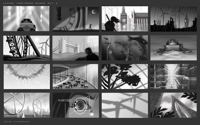
Immediately, Steve assigned "mood boards", story beats and other art that visualizes a general tone of the story, but only in three values. The idea here is to get a strong composition and mood that identifies the feeling of the story. I decided to focus on act 2 of my story, and although these are likely to change dramatically as the script develops, these were an awesome exercise that I will likely take with me on virtually every project I design on.


After the mood boards, we moved on to poster roughs. Creating a poster or cover art go a long way towards representing the overall motifs of the story. Working on this exercise has really helped me to think more deeply about the motivations and core ideas of the story I am developing in a way that I might not have otherwise thought of. 

Here are are my initial roughs. 


I will likely pick one of these from the second page, perhaps incorporating a border as well. I'll post the final after I finish it in a few weeks,  probably a week or two after CTN in Burbank this week! :)

Stay tuned, and thanks for reading!

Yosemite & The High Sierras, 2015

This past July, I went with my family to the fabulous Yosemite National Park, Lake Mammoth, and Bodie. It was a family trip that was packed with activities and endless inspiration all around. Yet we were surprised when the hot, dry heat suddenly turned to RAIN, THUNDER, LIGHTING, HAIL, and SNOW! In fact, the Tioga Pass had to be closed one night due to snow and slick conditions along the windy, high elevation road.

The weather curbed my painting time since my pastel kit would have melted if gotten wet. I regretted not having brought my oil kit, which can work in any weather. Because of the weather, I managed to sneak in just a few studies, mostly under the threat of rain or the watchful eyes of aggressive squirrels and scrub jays looking for a handout.

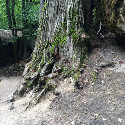
One hot, semi-rainy afternoon in Yosemite I went out a long the Mirror Lake trail. I was completely blown away by the massive moss covered granite boulders and pine trees everywhere. 


The scale alone is impressive! 


I stopped along the way off the path in a quiet spot from the huge crowds on the trail, spreading out my pastel kit on my oil cloth picnic blanket only to be visited by two squirrels who came right up to my backpack and sniffed around. 


On another day out we all went along the Vernal Falls trail, which is mostly uphill. It was fortunately a bright, hot, sunny day with great light. On the way back down the trail I climbed up some rocks, found a nice spot and painted this quick 45 minute study. 


I ended up spending more time along the Mirror Lake trail since it had great views of the North face of Half Dome.


This view (above) is the base of Half Dome, while the painting below is a study of the entire North face of Half Dome, a different view of the usual one we see in photos of the park. 


After a full week bike-riding, playing, hiking, and laughing around Camp Curry, we left to make the long drive up to Mammoth Lake, stopping at the historic gold rush ghost town Bodie. A massive thunderstorm was on it's way, making it impossible to do any sketching.

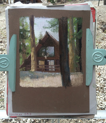
We eventually made our way to a cabin deep in the Mammoth Lakes area near Lake Mamie. We took a shuttle up to the Mammoth Adventure Center, where I found some a-frame chalet style cabins I wanted to paint. 


Just as I was finishing rain drops started to hit the paper, and I raced to cover it all up. 


*********************************************************************

What I missed in plein air time I made up for in art viewing.  Hanging on the walls of the famous Ahwahnee hotel is a collection of gorgeous Gunnar Widforss watercolors that are worth checking out, along with the collections of Native American baskets, stained glass windows and hanging textiles. 

The Ansel Adams Gallery on the Yosemite grounds is really more of a store but underneath large prints of his work hanging on the walls, beautiful books, prints and postcards of his work can be bought there. 

I think my favorite art viewing place in all of Yosemite was a small gallery that contained a collection of paintings by 19th and 20th century artists who painted around the valley floor after the landscape was designated as protected by Abraham Lincoln. 

Below is a painting, "Yosemite Valley, Winter" by William Keith (1838-1911) that I looked at for some time. I am always amazed at how little detail an artist can get away with and still create a landscape that says everything it needs to. It also made me really want to visit the valley floor in snowy winter!


The brushy strokes of the trees are so simple. I've painted tons of trees and I have yet to achieve the gesture of one that is as effective as these trees in this snowy landscape.


Careful gestures of the figures and horses - not too much over modeling.


On a plaque next to this Thomas Moran painting (below) was this description:

Thomas Moran joined the Hayden Expedition to Yellowstone and traveled at his own expense to record the landscapes along their route. His paintings and the photographs of William Jackson were used to persuade Congress to protect Yellowstone, much as Carleton Watkins' Yosemite photographs had been used in 1864. He continued to interpret western landscapes - including Yosemite and the Grand Canyon - throughout his life, often on a grand scale. His daughter donated many of his works to the Yosemite Park after his death, and these pieces are now part of the collection of several national parks. 


This Andreas Roth (1872 - 1949) painting impressed me up close when I looked at his brush work. "Inspiration Point, 1933. 


Again, groupings of trees painted with simple masses. I love the negative painting in the shadow areas that create the look of tree trunks too. You see that a lot in watercolor but I've not seen it in oils very often.


I love the washy transparent masses of trees in the distance against the more opaque foreground tree. Works so well.


The watercolors of Gunnar Widforss (1879-1934) are always amazing to me for just the technique alone. The description says they were painted on pebble mat board. It seems the focus of Widforss' work was texture of things like trees, plants, rocks, almost pattern like in their treatment. "Halfdome in Autumn", 1923


Frederick Schafer (1839-1927), "Morning in Yosemite Valley, Cal.", 1887


At first this Albert Bierstadt (1830-1902) painting, below, appeared to both my dad and I a bit overly dramatic, but when I looked at it further I began to appreciate the masterful vignettes within the larger painting.  "Night at the Valley View", 1864


*********************************************************

When we went up to Mammoth we stayed at a little cabin that had a nice porch area. On a few showery days my nephews and I sat out on the porch drawing and painting in our sketchbooks. What a cool experience to spend in sketching sessions with your own family. Nothing could be more fun!


Thanks for reading!


CTN Ad

This year I took up the opportunity to advertise in the CTN Sketchbook, a collectible printed sketchbook you can buy. I created this ad using some of my art. The book is in black and white, and because of that I submitted this piece in black in white. The 2015 sketchbook should be available in a few weeks at the

CTN STORE

I liked the composition a lot, so I also created it in color, too. I also made a bookmark of "The Act". I will have both color bookmarks while at the show. If you see me ask for one - they're free! Ping me at @Paintkatt on Twitter if you're at the show and want a bookmark!


Thanks for reading!

BACCA workshop with Michael Klein

"Every worthwhile art movement supports and encourages it's members to become better at what they do." - quote from Michael Klein.

This summer I have been very busy taking a Maya modeling class while I am also working on a personal project. Although most of the work I've been doing involves staring into my computer screen for most of the day, when I heard artist Michael Klein would be teaching a floral still life workshop at the Bay Area Classical Artist Atelier, otherwise known as BACCA, I jumped at the chance. 

Here are just a few examples of Michael Klein's work, focusing on his florals. His work encompasses figures, still lives, and semi-narrative pieces, all done in a painting manner that brings the spirit of the subject to life with energetic, yet carefully planned brushwork. Much more of Klein's work can be seen on his website:

I love the textures and depth that he paints in his floral arrangements. They remind me a little of Fantin Latour florals while still being all his own.

 Michael Klein's progress shot from his blog on his website. GORGEOUS!

********************************************************************
BACCA

The Bay Area Classic Artists Atelier is a wonderful traditional 19th century atelier right in the midst of an industrial park very near to Silicon Valley in San Carlos, California. The studio itself, run by tireless founder Linda Dulaney and a few dedicated studio hands, was comfortable to work in, providing taborets to store our supplies during the week, daily snacks, coffee, and relevant reading material on hand.

The atelier has a wide array of on-going workshops, courses and a once a week open studio with a model. During Michael Klein's floral painting workshop, next door in the adjoining studio, Dan Thompson was conducting a gross anatomy course with afternoon visits to Stanford's lab to study from a real specimen. I loved that there was a lot of great art on the walls that was not only Linda's, but also artists who have taught there, including great anatomy breakdowns on big sheets of butcher paper. Inspiring!

********************************************************************
WORKSHOP NOTES

Materials 

Michael Klein provided us with an interesting palette of colors and arrangement I have not seen before now with lead white or titanium white in between his yellow and orange hues. Interestingly, he begins his arrangement with Viridian. Omitting Cadmium Red, he instead included Cadmium Orange. He also includes Ivory Black on his palette. Just past Ivory Black, low saturated colors sit towards the end of the palette arrangement with Raw and Burnt Umber. Colors are as follows in this arrangement:

Old Holland Viridian Green Deep
Michael Harding Raw Sienna
W and N Yellow Ochre Pale
W and N Cadmium Yellow Pale
Rublev Lead White no. 2
OH Cad. Orange
W and N Burnt Sienna
W and N Perm. Alizarin Crimson
OH Quincinadrone Magenta
W and N Cobalt Violet
W and N Cobalt Blue
OH Ultramarine Blue
OH Ivory Black
OH Raw Umber
OH Burnt Umber

Mediums used were simply Gamsol for cleaning brushes, which he uses mostly on the first day to thin down the paint a little if it's too thick or sticky. After day one, he uses a widely known mixture known as "fat medium", equal parts linseed oil plus damar varnish. In later stages of his paintings, he makes use of Rublev Oleogel to thicken up paint strokes and add texture. Paint rags were Viva paper towels.


I did not have Oleogel for the class, so Michael gave me a tiny smidgen to test out. The gel is used for glazing, but also for adding body and flow to the oil paint on top layers. It is truly amazing stuff. I ordered a big vat of it along with the lead white. Michael noted that with Lead White he will sometimes mix it with a few drops of walnut oil to loosen up the stiff mixture. (He also uses stack white from Rublev to create texture, although he wasn't using it in this workshop.)

Surface and Easel: Like many painters lately, Michael Klein paints on dibond, an inexpensive but very durable metal composite that is easy to order. It comes in one big sheet that arrives with a light primer on top, which he sands and then cuts into smaller pieces, after which he applies either gesso or lead gesso on top. Dibond sheets are easy to cut with a box cutter, which you can use to make scores and then break off into smaller sizes. Also, since the sheets are magnetic, they work really well with the magnetized holding mechanism of the Edge Pro pochade box, which he was using with a tripod. (I have one as well - it's very durable and sleek, although I can't recommend it for carrying around on long hikes because of the weight.)

Brushes: In our workshop, Michael Klein mostly used synthetic rounds. Rosemary and Company will be soon making a custom set of Michael Klein brushes which come with short handles and a pink rosey color he designed specifically for floral painting. I will definitely order a set!


Michael's custom brush set right under that tube of paint. 


*****************************************************************
Process

Each of the four days of Michael Klein's workshop, he worked on a painting demo. He typically spends about 3-4 days working on a floral still life.

Mixed in with his natural flowers were two artificial flowers, which he doesn't like to use but did for this class. He noted that when flower companies make good quality artificial flowers, they mimic natural color patterns of the flower, like spray painting the joints of the stems and leaves with a little brownish overlay instead of one uniform green and will also boost saturation of petals. When using artificial flowers, you will need to understand the methods that manufacturers use to make their flowers appear real and compensate by using your observation and knowledge of real flowers. However, use real flowers whenever possible.


Michael's demo from the first day, pictured above. He explained that when it comes to floral paintings he usually spends the first day blocking in the first half, the second day the second half, third and fourth day for finishing and adjusting. Although he used to spend a lot of time making a detailed line drawing, which he then transferred to canvas, he no longer uses that method. These days he instead dives in with a block in of basic shapes, starting with the background area as a foil against the larger shapes and green leaves that typically sit underneath the main forms of the flowers. He sometimes uses a very soft fan brush to lightly brush over the background to knock down some edges and to avoid glare on the surface. He also noted that he tends to work from the center out, working on each shape one at a time.


My initial block in, above. Michael thought my background color was too far into the brown/warm tones so I worked on adjusting that the next day. I had been thinking I would warm up the cool ivory black background to be more warm, but he felt I should stick to the truth of what was in front of me because of the reflected light that worked into the flowers, especially the yellows. 

On the second day, after watching more progress on Michael's demo, I made color adjustments to the background, after which I spent a lot of my time making drawing adjustments in order to get the shape relationships to balance a bit better. Unfortunately, it was then that I noticed I placed everything too far to the left of the canvas. Michael told me I could emphasize the atmosphere in the background to compensate. Using light as an element of composition is always a plus, in my book. 

End of the second day I got most of the big areas in, adjusting drawing, color and value.

When I came in the on our third day, I was disappointed to find that almost the entire black background had sunk in, making the paint appear a dull lifeless black! Ugh! That might be ok in some situations, but in this case it really dulled out the color and made the flowers themselves look terrible. Michael explained to our class that sinking in happens when you paint over a dried layer of paint with no medium, which is why using some medium in subsequent layers is necessary. Sinking in can be fixed by either repainting or using spray touch varnish, which I couldn't use in this case because I would be painting all day and couldn't wait for the areas to dry. After some touching up and repainting, I realized I had lost the gesture and luminosity of the initial block in, which is so key to making florals feel fresh. A serious downer, but I pressed on. (incidentally, if I were at home working on this, it would be at this point I'd quit and start over)

You can see the sunken in areas especially in the black passages. The color here was completely painted over in order to correct the hues, but instead of remaining luminous, it flatted out and sunk into the canvas, creating a dullness. Yuk yuk yuk!!!

As for overpainting on a dry surface that already has oil paint, Michael explained that if you cut into paint with more turp (gamsol), the painting will crack, which is one reason, along with sinking in, that using a medium is necessary at this point. (In fact I have seen this happen in some of my own older floral paintings, a few of which I will not sell because of the cracking.) He likes to use linseed oil mixed with equal parts of damar varnish (a similar mixture "fat medium" that I've used in other classes). This along with Oleogel should be sufficient. It is OK to continue to clean brushes with gamsol, just as long as you don't cut the gamsol into your paint mixtures to thin down paint. (Don't panic if a few drops inevitably get in there, though!) A hard lesson to learn, but I will probably never forget...


After fixing what I could in the background, adding some light coming from the upper right, I pressed on, mainly working on the color relationships between the yellow flowers, and the white ones to the right. 

Michael had an interesting side demo (below) on the paint effects that can be had by layering pigments. For instance, the neutral warm background color, when brushed or scrubbed into the surface, appears warm. When that very same color is lightly scumbled over the same, but thinner color, it appears to be cooler. How awesome is that? Also, he layered on thicker colors like a basic warm burnt sienna/ultramarine blue mixture that serves well for green shadows and then worked up to a floral orange hue to show the depth that can be created with these particular mixtures. 


As for color mixing in general, he explained that he doesn't like to overmix his colors on the palette, but instead "loosely" mixes, keeping a bit of each original color separate, so that when the colors move on to the brush and then the painting, a light effect mixes them in our eyes, producing a color vibration. This is a technique I've seen before and used myself, especially with pastel paintings, and also have read about. Golden aged Illustrator Haddon Sundblom's painting method included using two pure colors on one brush to create a mixture directly on the canvas. I'm not sure if this method is an innovation by the Impressionists, but the idea of vibrating color via broken color and paint layers feels impressionist to me. 

Also, regarding color mixing on the palette, Michael encouraged everyone to create a "puddle of color" that is essentially a color portrait of the thing you are painting, otherwise you will end up with a lot of muddled color. My own tendency to dance around the palette with all sorts of mixtures usually leads to confusion at times, which I need to work on correcting. He does not create "strings" of color on the palette, instead he creates the middle hue, shadow and light hues all in one puddle.


During his demo, he spoke a bit about using a combo of observation vs. knowledge of form. He explained that Jacob Collins emphasized a thorough understanding of form and how light moves across it, and it was when he finally understood what that meant, that he finally made some breakthroughs in his work. He went on to explain that after painting the initial gesture on the first day, he will start thinking about what he knows about how light reacts on the surface of particular forms. Often, he will not look at the still life but instead focus on the object being painted, paying attention to the direction of the light source and modeling the form so that it reads clearly while still maintaining the beauty of the still life. 


This becomes particularly necessary when painting subjects like flowers, which change each day. When asked about his atelier training compared to how he paints now, he explained that in his current work, he is now concerned with evoking a mood or a feeling rather than rendering every bit of the subject in front of him, trying to find that balance between the truthful statement vs. gesture. 

For form painting demos, Michael recommended the excellent form painting lessons by fellow Grand Central graduate, Scott Waddell. I've seen all of Scott's videos and they are indeed incredibly useful.

My final painting, which I've cropped to make a more attractive composition.

On the fourth and final day, Michael helped me at the end make some value relationship adjustments and talked with me about editing to the highlight, which did not serve the overall painting as it was too eye catching and distracted from the main subject. His emphasis throughout the workshop was always on the final, poetic statement rather than a 1:1 rendering of the subject, which I agree with wholeheartedly.

Michael Klein's finished four day demo.

During his demo on the fourth day, he spent some time working again on the main white rose, making shifts to it because it had opened more fully than it was a few days earlier. Rather than repainting it entirely or making too many drawing adjustments, he simply added to it, explaining that he liked that the new additions added more variety to the painting.

*****************************************************************

Is it Alla Prima?

I think over the years that the term Alla Prima has become overused and misunderstood. Alla Prima is strictly a one session painting. That session might last a full 12 hour day, sure, but it is always one session, wet into wet. This came up because I think, generally speaking, people tend to assume that any painting that has a looseness to it is an Alla Prima statement. I asked Michael if his paintings are not AP, what are they? His answer was simple, they are just paintings! 

On a personal note, when I was first introduced to oil painting as an 18 year old art student at the American Academy of Art in Chicago and then at the Palette and Chisel where Richard Schmid and many other amazing artists were painting, I fell in love with what the medium could achieve and the promise of what I might be able to as well. I had never seen paint become so intriguing; sketchy, energetic brushwork that came together in harmony to represent everyday things like portraits and figures, still life, and animals with rich color and layers of texture. That is where I first heard the term Alla Prima, the painting approach that Richard Schmid popularized throughout the 80's and 90's and especially with the release of his book, Alla Prima. 


1993, I think. I believe this was a four hour demo. I mainly remember being so stunned at how quickly he was able get down rich color juxtaposed against greys in the white objects - and especially how loose and sketchy it all was. 


Of all those years, this unfortunately blurry photo along with the one above are all I took of the actual man. The majority of my photos taken were of actual works hanging on the walls in revolving shows, auctions or works in progress. I'm still kicking myself for taking these blurry photos! 

As much as I love a good Alla Prima sketch, my question has always been the same, how can I maintain the look of an Alla Prima sketch but work on it for multiple days without losing that fresh brushwork? Often, when I worked on a painting more than one day, many of the problems I encountered in this workshop were similar - sinking in, dry cracking paint, or thick paint that just looked dull and lifeless, overworked, over rendered, boring. I've always admired painters that are able to maintain a fresh feel in their longer pieces, giving the impression that the work was painted quickly and effortlessly. It was a pleasure to finally meet Michael Klein and get to chat with him about various ways to strategize and plan a painting to create a mood, a visual poetry, throughout a longer, more elaborate work. What a great experience, one that I will keep close throughout my new paintings.

Note: My next several updates will be a switch back to digital work for a personal project I am working on. Entirely different, and yet so many of the core concepts overlap one another. 

Thanks for reading!

The Unfortunate Toad

This summer I have been working on a short story that I plan to bring to print. It is about a Toad, and is tentatively called, "The Unfortunate Toad". 

There is a cast of characters that you'd expect in a fairy tale, but in this story their roles are a little different, due to some unforeseen circumstances.

I thought I would share some of the work I've created so far. There is a lot more in the works, including many more characters, but I will be keeping those to myself for awhile. In addition to "The Unfortunate Toad" story,  in the next few months I will be posting a few more updates to "The Time Machine" and other art that I have been working on behind the scenes. It's really exciting stuff that I can't wait to share!

***********************************************************************


Please stay tuned for more in the next two months! Thanks for visiting.


Disney's Palace Pets "Whisker Haven Tales"/Environment Designs and Color Keys

I recently had the honor of working with Ghostbot and Disney Publishing on ten 3:30 minute episodes of Disney Junior's "Whisker Haven Tales with the Palace Pets", directed by Alan Lau. Episodes can be seen here: 

www.DisneyPalacePets.com 

My primary role was to develop background "key" environments working from the approved animatics. If you aren't familiar with animation, a color key is an environment design that establishes a location, color palette, and lighting. It is then referred to by other artists on the  the team that need to create various points of view surrounding that piece of the film in the sequence. Elements like water that animate were tricky, especially bubbles. We had to take a close look at how bubbles looked under the water and out of the water. 

Time of day was a major consideration in many episodes. I created guides for blocks of 2-3 hours for each time of day so that the color remained consistent throughout the episodes. 

More episodes will be available soon via the Disney Junior Watch app on iTunes! The show is doing very well. It was a pleasure to work with Ghostbot and Disney on this exciting new show! 

Disney's Palace Pets, "Tales From Whisker Haven"/Color Scripts!

I recently worked on ten 3:30 animated episodes for

Disney's Palace Pets

, a new show on

Disney Junior

. There is also a new Palace Pets Website (!!!) which can be found at

www.DisneyPalacePets.com

The show was developed and produced at

Ghostbot

, directed by the talented

Alan Lau

. It was such a fun project for me personally as I served as Art Director on environments, props and color design. The show was definitely challenging as the Palace Pets have been a successful toy line for Disney for a while now and have a multicolored pastel palette. For this reason, color scripting was necessary on several of the episodes for either a full episode or portions of sequences that were particularly tricky to work out.

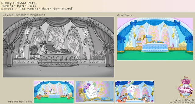
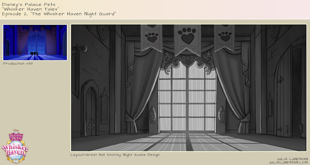
Below is my color script for my favorite episode, "The Knight Night Guard". (available to watch on the Disney Junior app now!) Color scripts, if you aren't familiar with them, are a way to get a big picture take on the color design for an entire episode or sequence. It is important to focus on the storytelling as scenes move from shot to shot and sequence to sequence, and make sure the planning for the lighting and effects is consistent logistically from one scene to another. They also are very helpful for animators so they can get a big picture idea of what it is we are shooting for, and also are very helpful for the compositor when piecing together all of the various elements into one shot. Additionally, I enjoy designing color scripts since they give me a chance to think globally about how I want to approach the design of specific environments and how much work I will need to do for specific areas of a sequence, and the work load we are facing in terms of environments and props for a particular episode or sequence.

Below are some stills from Episode 3. They translated pretty closely to the color script - good planning is worth it!

Below is a partial color script for Episode 4, "Throwing a Ball". I didn't have time to do a color script for the entire episode so I focused instead on a tricky sequence that takes place with a time of day change.

Below are a few shots for the final. (Additional characters were added after I did this initial color script.)

I actually did a few more of these but those episodes are not yet released. 

Please check back for updates and be sure to watch Palace Pets "Tales of Whisker Haven" on Disney Junior! Next week I will post about some of the environments and props I designed. Thanks for reading!

Pacific Marine Animal Studies

Some more studies from our recent trip to the Monterey Bay Aquarium. I spent most of my time trying to capture a gesture or general feel for each animal, then tightened up my sketches later using photos I took and in some cases video, the puffins being the most difficult since they were very busy beasts! 

The jellyfish exhibits are like nothing else I've seen at other aquariums. Absolutely stunning.

Moon Jellies (above) are in abundance in the Pacific Ocean, however because they are white they look very similar to white plastic bags. Sea turtles have mistakenly eaten plastic bags and died as a result, one more reason to go from plastic to paper. 

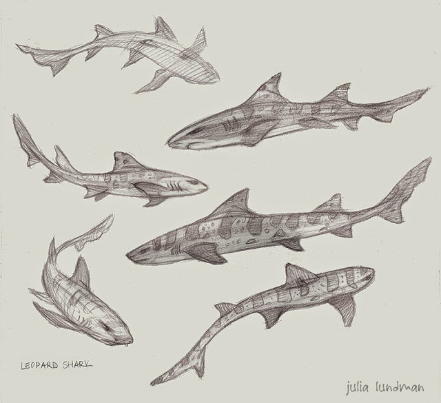
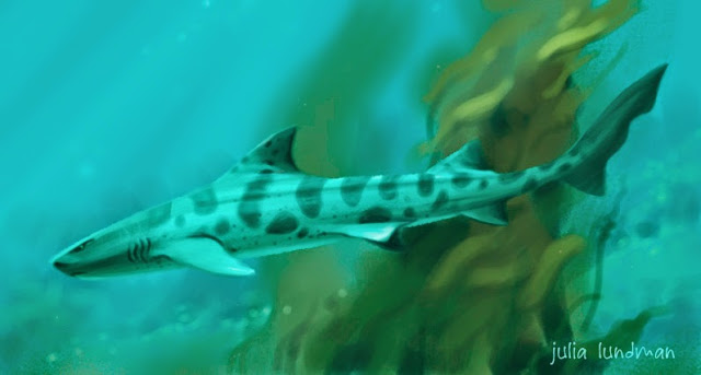
I really loved these gentle sharks. Conservationists are concerned about them becoming overfished due to sport fishing along the Pacific Coast, where they live, mostly along kelp forests and rocky areas. 

Tufted Puffins are in abundance along the Pacific Coast, especially up toward the Aleutian Islands in Alaska. I loved watching them - this guy was very curious about us! 

The light shining through the water in the Kelp Forest exhibit made the anchovy schools look magical. Anchovy schools tend to gravitate toward long columns of kelp in a swirling spiral upward. Sublime! I did these studies from some video footage I shot and then painted various parts of different shots to make it all work together as a portrait of the habitat.

Monterey Bay Aquarium/Color Studies & Sketches

Jamie and I recently went on a trip down the coast to the Monterey Bay Aquarium, one of my very favorite places in the world. We both brought our drawing, sketching, and painting supplies, including my new samsung tablet. Because most of my color sketching was going to be done inside the aquarium, I carried around my tablet in my messenger bag and took it out when I saw something I wanted to study.

As mentioned in my previous post, the primary reason I purchased the tablet was so that I could do a lot more color studies of interior lighting in situations where it would be difficult to take out my usual paints or pastels, places like restaurants, cafes, aquariums, museums, unusual interior lighting situations. Boy am I glad I did. Each time I would sketch from life in the aquarium, I would take a photo before I left. When I would look at the photo later, I noticed a HUGE difference - the camera most of the time did not capture the lighting effects I observed, and if it did, the spirit of that light was completely lost, subdued, or just not there. What an amazing learning experience!

***************************************************

Below are a few of my digital studies. I also did numerous pencil and watercolor studies of the animals in the aquarium, and a few pastels from up the coast. I will post those next week.

 The Kelp Forest. So glad I brought my noise canceling headphones for this one. There were deafening crowds of pre-teens on a field trip with their school. You never know what will confront you when plein air sketching - I highly recommend headphones if you sketch in public places. 

I liked the presentation of this display so much. The blue light spilling from the water and the  yellow-green reflections of the kelp were gorgeous. I felt the design stood well on it's own.

The sketch above is downstairs looking into the Sea Otter display, sea otters mostly spending their time up above water and only occasionally diving below. I noticed this perch watching people as they went by and thought it was funny...

Some sketches went faster than others. This one in the Deep Sea Exhibit was done in about 30 minutes. It was at the end of the day and just seemed to flow. I figured out a composition and story as it evolved in front of me. 

Of all the subjects I studied in the aquarium, this jellyfish display was absolutely the most difficult. I sat across from the display on the floor against a wall in almost total darkness. My eyes had adjusted to the dark, but when I looked down into the bright computer screen of my tablet, my eyes would adjust to that brightness, so that when I looked back up again at the jellies, I had to give my eyes a moment to adjust to the darkness again. VERY tough! I spent a good two hours trying to capture the light of the tank. Wow, what a learning experience this sketch was! 

A Couple of Plein Air Digital Paintings

For awhile now, I've been trying to come up with an easier take-with-me-everywhere method of plein air sketching. I have full plein air kits for pastels, oil and watercolor, but often I find that even though I keep one of these kits in the trunk of my car, I usually don't feel inclined to bring it all in to a restaurant, coffee shop or on an afternoon trip downtown. I wanted something MUCH more lightweight and accessible - and the iPad has been it.

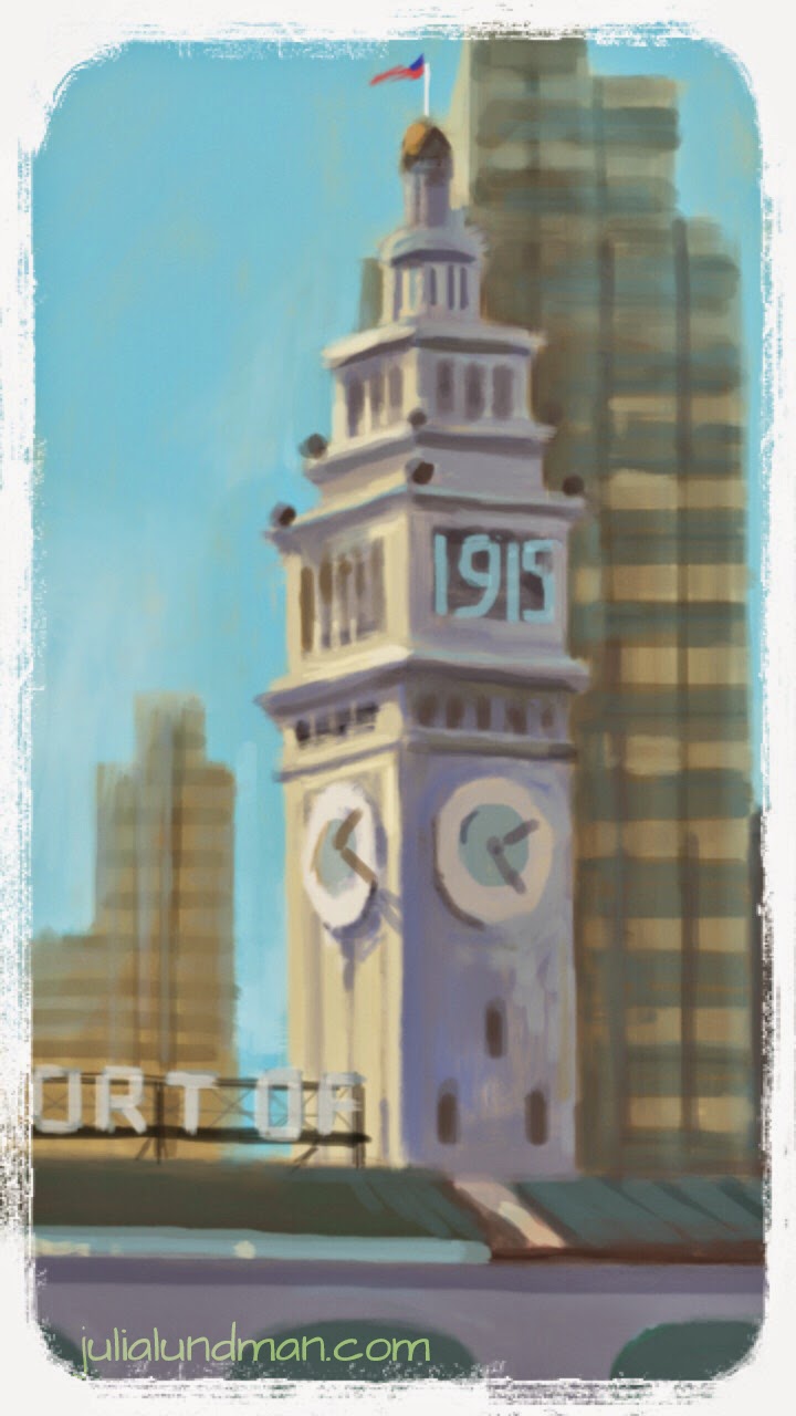
Here is a sketch from a recent day trip to the ferry building in San Francisco, a busy tourist-heavy area of the city. 

A lovely day plein air painting at the San Francisco Ferry Building. I used the iPad Air, Procreate app, and Wacom Stylus 1. Music by Karrin Allyson, "From Paris to Rio". A note about the stylus: I recently purchase the Wacom Stylus 2 and discovered it does not work with many apps, including Procreate.

My main objective with iPad sketching is to mimic plein air oil paint using the alla prima technique, direct painting, as opposed to more labor intense methods. The idea is to work quickly on site and get it all down in about an hour or so of working. That means everything from gesture, composition, hue, value relationships and light relationships.

About the hardware: I have yet to find a stylus I am completely comfortable with; I am currently using the Wacom Creative Stylus. I am not keen on recommending it, however, because it feels like painting with a giant crayon. I unfortunately purchased the Wacom Creative Stylus 2 and found afterwards that it is not compatible with many painting apps, including Procreate. A few friends have given good reviews of the Jot Adonit Stylus, which is far cheaper and compatible with a lot of apps. 

In the Procreate app, I created a set of swatches in the color picker that are the standard colors of my basic oil painting palette, plus a few white convenience colors so that I don't have to constantly mix the same color over and over. Using these swatches helped me in getting a similar look to traditional paintings, although I think I could still fine tune the set. 

In addition to that, I am still trying to refine my brushes to find a working method that mimics traditional brushes. Procreate provides a set of brushes that you can then customize, but  I have yet to find some that are to my liking.

Continuing my exploration of digital iPad paintings with the Procreate app, I've tried to mimic my oil painting palette in the color picker to see if I can narrow down my palette choices. I am trying to find a good working flow for alla prima digital studies that actually look like oil painting sketches.

Composition Breakdowns

In a recent class I took at the Animation Collaborative with the inspiring and seriously talented Armand Baltazar, we had an assignment to break down the compositions of narrative illustrations from visual development artists. We had to

1. write one sentence describing the story of the piece, 

2. describe the point of view (POV) of the piece, and 

3. describe the emotion intended by the piece. 

After that, we drew over the composition breaking down these elements:

 4. the division of the graphic plane (the graphic shapes that make up the composition),

5. Redline the division of depth and mark the foreground, middle ground, and far background,

6. Mark the center of interest,

7. Redline where the eye moves across the piece.

This was an excellent exercise in understanding the architecture of a picture and the thought that goes into guiding the viewers' eye directly to the center of interest. I highly recommend analyzing compositions in this manner for anything from drawings, paintings, and even sculptures to increase your own narrative compositional chops.  

Although the exercise appears simple, I learned a great deal by analyzing each piece. There were some pieces that I haven't posted which failed compositionally; the artist meant the eye to go to one place but unfortunately the eye focused elsewhere. 

Year of the [Electric] Sheep

In 1968, Philip K. Dick wrote a groundbreaking book, “Do Androids Dream of Electric Sheep?”, which was later turned into the film, “Blade Runner”,directed by Ridley Scott. Perhaps the best (at least to me) science fiction film and story of all time. Douglass Trumbull designed all of the practical effects, a profound inspiration on science fiction film and myself all these years. In honor of Year of the Sheep, I did this speed paint.

In 1968, Philip K. Dick wrote a groundbreaking book, "Do Androids Dream of Electric Sheep?", which was later turned into the film, "Blade Runner",directed by Ridley Scott. Perhaps the best (at least to me) science fiction film and story of all time.

Year of the [ Electric ] Sheep. Recorded with Camtasia Studio. Edited in iMovie. Painted in Photoshop CS 6. Initial base layer texture from Cgtextures.com. Custom brushes. Observational study of a sculpture I photographed in the Louvre in 2012, a marble vase originally in Versailles. Music by Vangelis, "Blade Runner".