"LOSING TIME", Poster Roughs
This year I have been very busy writing and rewriting, and then rewriting again the story for a graphic novel tentatively titled, "LOSING TIME".
The story takes place in the same universe as HG Wells' 1895 classic, "The Time Machine", but is an expansion of that world and events.
Since I am also currently enrolled in Pixar Production Designer Steve Pilcher's Production Design course at the Animation Collaborative, I thought I would focus my class efforts on moving forward with this project to see where it would lead with some really great feedback.
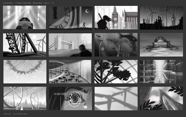
Immediately, Steve assigned "mood boards", story beats and other art that visualizes a general tone of the story, but only in three values. The idea here is to get a strong composition and mood that identifies the feeling of the story. I decided to focus on act 2 of my story, and although these are likely to change dramatically as the script develops, these were an awesome exercise that I will likely take with me on virtually every project I design on.
After the mood boards, we moved on to poster roughs. Creating a poster or cover art go a long way towards representing the overall motifs of the story. Working on this exercise has really helped me to think more deeply about the motivations and core ideas of the story I am developing in a way that I might not have otherwise thought of.
Here are are my initial roughs.
I will likely pick one of these from the second page, perhaps incorporating a border as well. I'll post the final after I finish it in a few weeks, probably a week or two after CTN in Burbank this week! :)
Stay tuned, and thanks for reading!


