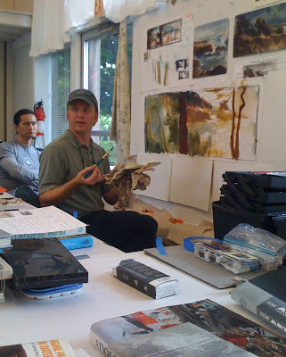
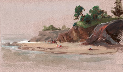
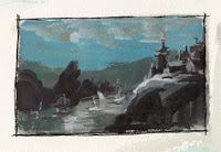
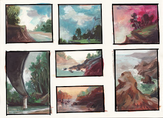
So, the Lucky Charms redesign ended up being a success with the ad agency that handles the General Mills commercials. Calabash then went into the story board phase with the new look in mind. Since this was such a departure from the standard Lucky Charms commercials, I was asked to come up with a color script using the story boards that the director made. Here are a few select panels from the color script. I've written a few words about it below, too:


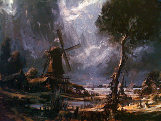
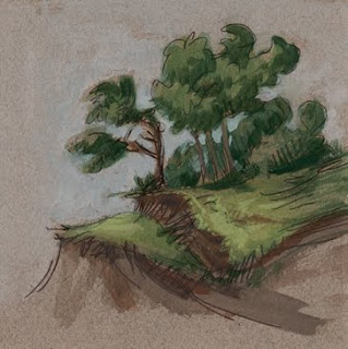
I spent a good deal of time coming up wtih the palette and lighting in order to suggest a dark and mysterious forest, but not too scary. I thought that if I used a somewhat saturated purple in the shadows, the color would have the duel effect of being a shadow and suggesting magic. I also thought the forest would look as though it were a 'deep' woods that does not get a lot of bright sun if I used an emerald green local color on the grassy areas instead of the typical sap green. Also, it was tempting to make the very distant areas dark to suggest darkness, however, I decided dark tones in the distance would make the woods look more frightening, so I kept those areas light and desaturated.
All in all, I enjoyed working on this campaign. I ultimately ended up color scripting all of Calabash's General Mills commercials, which ended up being useful in many areas of the production process, from pencil test, to ad agency approvals to compositing and effects. The color scripting work I did for Calabash was always my favorite part of the job. I miss it!

A few years ago, the ad agency that handles the Lucky Charms campaign wanted to revamp the look of the character's world. The directive they gave artists was 'Harry Potter-ish, magical and mysterious'. Calabash, the animation studio that produces the commercials, asked me to come up with some concepts, which are the two paintings below.


Also, my ex husband, Mike Midlock, drew the Lucky and Crow concept and I painted it for him:

I also painted this house, which was based on a quick sketch by the senior animator/director at Calabash, Wayne Brejcha. In the end, the agency decided that this look was faaaaaarrrrrr tooooooo dark for a cereal commercial, so I was asked to lighten up the color of the house, making it day time instead of night and make the colors more cheerful.

I still think it would have been neat to see a creepy Lucky Charms, but then again we don't want to scare the children!

Some Keebler Elves Backgrounds

Back in the 90's, I was a background painter for a commercial animation studio, Calabash Animation. This was the first job I had right out of art school. I am grateful for the experience I had there; it was where I really learned how to mix color, apply paint and where I learned the value differences between foreground, background and midground.

I was trying to organize my archives this afternoon when it occurred to me that I don't have any of this work online anywhere.

I have many backgrounds and production art (concept and color scripts) which I will post when I get around to photographing and scanning. Some of my backgrounds are incredibly long pan scenes, since our director, Wayne Brejcha, liked to do elaborate, sweeping camera moves. Scanning those are impossible really - so I will have to photograph them - at least the ones that I still have! (many were sold at an animation gallery in LA in the mid 90's).


These backgrounds are all traditional gouache paintings on illustration board. They were for a Keebler Elves commercial. 

This painting of the Keebler Elves tree was dropped into a live action scene.


All four elves were sitting on this couch with wonderful flickering light. Wish I had a copy of the commercial to post.


This scene had some live action footage dropped into the white area of the tv.


Keebler commercials were always a DREAM to paint!

Erik Tiemens Watercolor & Gouache Painting Workshop

Over the past weekend, I attended the Erik Tiemens' Watercolor & Gouache painting workshop in Mendocino, California. Erik Tiemans, for those who are unfamiliar, is a concept artist in the film industry. A few times a year he teaches a workshop at the Mendocino Art Center. Overall, as a working illustrator, I found this workshop technically useful; as a painter I found this workshop inspiring.

Tiemens' palette is largely composed of the familiar colors many painters use, but with a slightly blue and gray emphasis with brown undertones. The influence of the Dutch Masters' painting is evident in his work, which he talked about to some degree on the first day.


Tiemens' approach to painting outdoors is similar to pre-impressionist painters, who would spend time in the countryside sketching from life (usually with sepia ink or watercolor), bringing the sketches back to the studio for further development. Here is a sketch he had hanging on the wall in class (a better photo can be found on his blog):


And here is a beautiful finished painting he brought to class:

Although Erik Tiemens works in the film industry as a well established concept artist with a great deal of respect, apart from that field he is just a really damn good painter with a lot of interesting work. It is difficult not to be inspired by his enthusiasm for the craft and history of painting.


But since this was a workshop, what did I take away from it?

Here are some of the field sketches I did during the workshop:


and small studies, experiments worked up from memory:


I love the idea of sketching out in the field, 'gathering data' as he referred to it, taking those sketches and experiences back into the studio to come up with something entirely new: a composed impression based on what was learned from life. To pull this off well, a certain amount of craft and skill is involved that one must, in the end, feel as though the landscape has not been slavishly copied, but rather pulled from a well of knowledge and creativity. In the end, the artist must arrive feeling completely personally immersed in self expression. Isn't that what it's all about? I left the workshop and the beautiful town of Mendocino completely inspired and looking in a more complete direction for my own work. I highly recommend this workshop for any working illustrator or fine artist who simply loves to paint.

Hummingbird Goes to the Aquarium


I am working on some illustrations for a character I envisioned many months ago named Hummingbird. At this time, she is a ten year old girl, although that may change down the road. In these illustrations, I am thinking about putting her in various scenarios in an aquarium, where she is thinking about the real creatures she is seeing and the fantasy creatures she encounters in books (mermaids, seahorses, underwater titans, etc).

Here are a few sketches. I will be working on these in the fall, bringing them to full color along with several other sketches. There is no real endpoint here; simply a bunch of fun illustrations that challenge me with various scenarios and lighting situations and a slight storyline for my character.

I enjoyed this reclining pose. No armature was needed underneath; it was approached like a bas relief, lay the clay down and carve out the figure. Although this is unfinished, I am happy with the progress I made. Usually by the end of two sessions, I am still fussing over minute details on the torso. This time I was able to block in a gesture of the figure, not over thinking anatomy.

I am grateful to be a part of the sculpting group. The benefits have been like a magic two way mirror; when drawing, i can see images of sculptures I've been working on, and when sculpting I envision drawings with volume.


I ran out of time and was not able to finish the hands, feet and face.
I also ran into a problem on this particular pose: bending the underlying armature in the right place. As you can see by the silver wire coming through the knee areas, I overestimated where the legs should bend. I thought I'd estimated correctly, but apparently not!

Lines


because i am a painter, i usually work tonally on figure drawings. the eye does not see contours around forms; the eye sees masses of shadow and light. for this reason, when drawing from life, many painters choose the tonal approach to drawing over the linear approach. while i agree that learning to see the light as opposed to delineation of separate objects is helpful for painting, after many years of working tonally, i have begun to feel that my work overall has a certain emotional disconnect. ultimately, what the artist is creating is work that expresses his or her own uniqueness, so do i really need to continue along a path in perfecting accuracy?

American Artist Magazine on the subject:

As prevalent as it has been historically, the contour remains an artificial construction. We don’t see in lines, no matter how accustomed we are to delineating objects with them. When I look out the window and see the edge of a building against the sky, I do not see a line, per se. I see a mass of dark tone juxtaposed against a mass of much lighter tone, and the point at which they meet creates an edge. This edge relationship might be described in an abbreviated fashion with a line, but it might also be more fully described by re-creating the tonal relationship between the two masses whose congruence makes the edge. In tonal drawing, there are edges to masses, rather than lines between them. To substitute a line for the edge of a value relationship is to substitute something that is not there for something that is. That is why linear drawing seems more abstract and intellectual. A line seems intellectual not because it lacks feeling—for what could be more emotive than a Leonardo silverpoint line—but because we don’t actually see in lines and therefore they have to be decoded or interpreted. Juxtaposed tones, being so much closer to vision, seem much more immediate.

i actually like a combination of the two, lines and tone. i hope to develop my drawings much further with the hope of emphasizing expressiveness; less literal, more experimental.

my lines are brown china marker and white conte pencil on pastel paper

A Personal Retrospective


For a few years now, I have desired to depart from the personal work I have engaged in since leaving art school, which tends to mirror my mentor and fellow students, who were no doubt a large influence on my painting. I put together a few paintings I have finished during this period for comparison. They all seem to lack the design and cleanliness of style I have been going for, and the subject matter is not coming through the way I'd like. They feel...... stalled, controlled, tense, and, interestingly, dark (which is odd for floral still lifes, I think). And do I really want to paint only still lifes? I think I find more joy in other areas, like figure painting/drawing and sculpting.