Disney's Palace Pets "Whisker Haven Tales"/Environment Designs and Color Keys
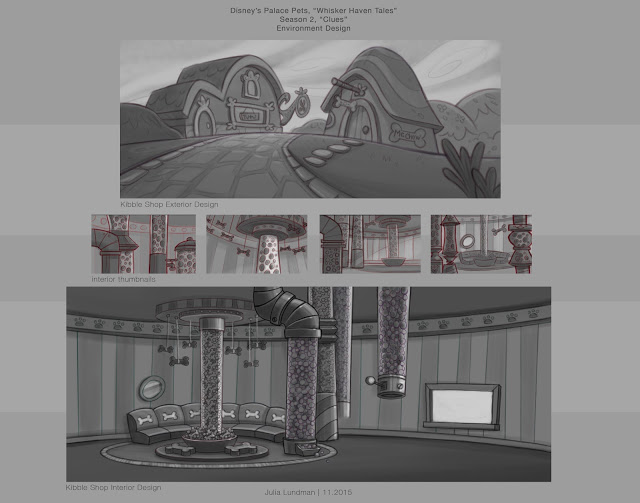
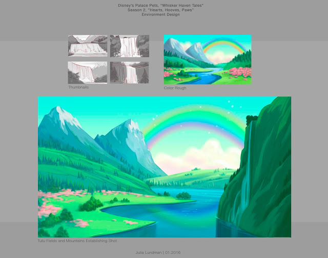
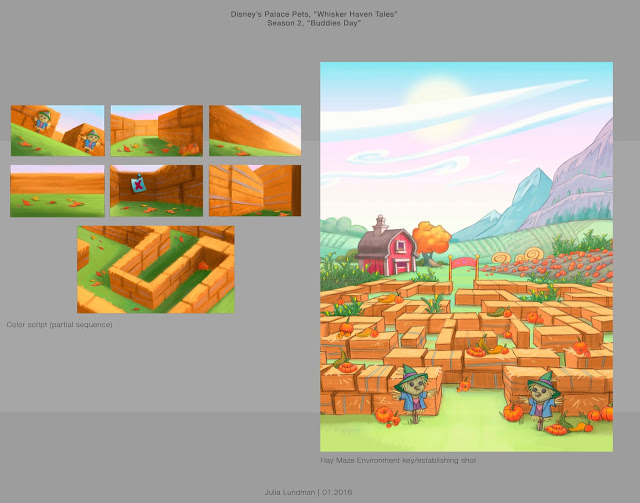
I recently had the honor of working with Ghostbot and Disney Publishing on ten 3:30 minute episodes of Disney Junior's "Whisker Haven Tales with the Palace Pets", directed by Alan Lau. Episodes can be seen here:
My primary role was to develop background "key" environments working from the approved animatics. If you aren't familiar with animation, a color key is an environment design that establishes a location, color palette, and lighting. It is then referred to by other artists on the the team that need to create various points of view surrounding that piece of the film in the sequence. Elements like water that animate were tricky, especially bubbles. We had to take a close look at how bubbles looked under the water and out of the water.


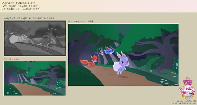


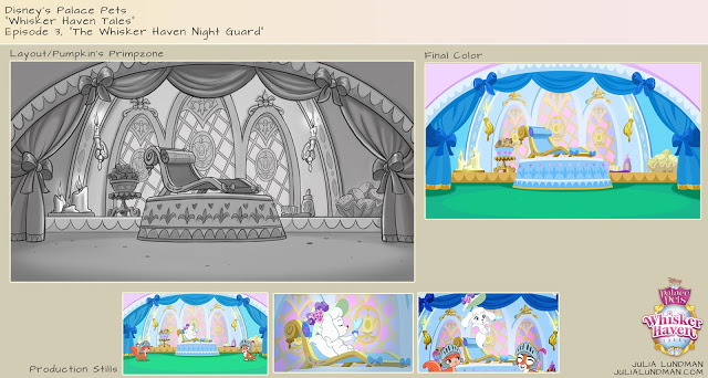
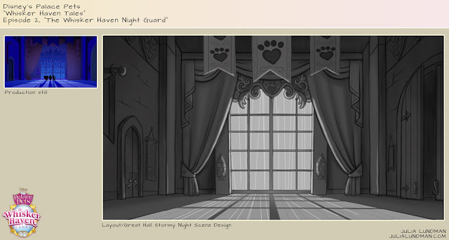
Time of day was a major consideration in many episodes. I created guides for blocks of 2-3 hours for each time of day so that the color remained consistent throughout the episodes.


More episodes will be available soon via the Disney Junior Watch app on iTunes! The show is doing very well. It was a pleasure to work with Ghostbot and Disney on this exciting new show!
Disney's Palace Pets, "Tales From Whisker Haven"/Color Scripts!
I recently worked on ten 3:30 animated episodes for
, a new show on
. There is also a new Palace Pets Website (!!!) which can be found at
.
The show was developed and produced at
, directed by the talented
Alan Lau
. It was such a fun project for me personally as I served as Art Director on environments, props and color design. The show was definitely challenging as the Palace Pets have been a successful toy line for Disney for a while now and have a multicolored pastel palette. For this reason, color scripting was necessary on several of the episodes for either a full episode or portions of sequences that were particularly tricky to work out.
Below is my color script for my favorite episode, "The Knight Night Guard". (available to watch on the Disney Junior app now!) Color scripts, if you aren't familiar with them, are a way to get a big picture take on the color design for an entire episode or sequence. It is important to focus on the storytelling as scenes move from shot to shot and sequence to sequence, and make sure the planning for the lighting and effects is consistent logistically from one scene to another. They also are very helpful for animators so they can get a big picture idea of what it is we are shooting for, and also are very helpful for the compositor when piecing together all of the various elements into one shot. Additionally, I enjoy designing color scripts since they give me a chance to think globally about how I want to approach the design of specific environments and how much work I will need to do for specific areas of a sequence, and the work load we are facing in terms of environments and props for a particular episode or sequence.

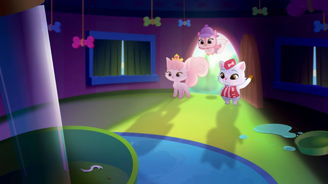
Below are some stills from Episode 3. They translated pretty closely to the color script - good planning is worth it!


Below is a partial color script for Episode 4, "Throwing a Ball". I didn't have time to do a color script for the entire episode so I focused instead on a tricky sequence that takes place with a time of day change.

Below are a few shots for the final. (Additional characters were added after I did this initial color script.)


I actually did a few more of these but those episodes are not yet released.
Please check back for updates and be sure to watch Palace Pets "Tales of Whisker Haven" on Disney Junior! Next week I will post about some of the environments and props I designed. Thanks for reading!
Searle in America Auction, "Reminiscing"
Since starting my new job last year at Disney Media Group/Playdom, I've spent a lot of time sketching and thinking about classic Disney characters. It seemed a natural fit when the "Searle in American Auction" came around that I might try a theme with one of the villains.
***update: my painting on this post SOLD today! There are a number of new pieces by other artists that have been added and more coming - be sure to check the auction page!
After sketching a few ideas out of Searle's birds and cats, I just kept coming back to the concept of Cruella de Vil relaxing in her home office... I did a little research on wikipedia, and what do you know?!! Cruella did indeed go to school in England! Here is an excerpt from Wikipedia:
In the original story, Cruella is a pampered and glamorous London heiress who knows the owner of the Dalmatian puppies through school, though it is mentioned that they were not friends. Her net wealth as mentioned in The One Hundred and One Dalmatians £6 million. She was a menacing student with black and white plaits. She was later expelled for drinking ink.
Of course that school was St. Trinians!
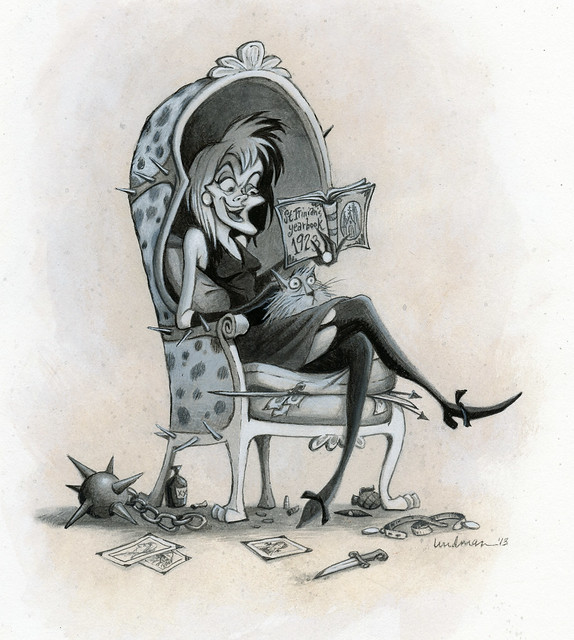
"Reminiscing", 10 x 12", gouache on board
************************************************
PROCESS NOTES
It's been awhile since I've painted something cartoony without a computer. These days at my job the characters, props and backgrounds I draw and paint are for pre-production concepts, so I don't often get to finish the art myself. I enjoyed researching Searle and his interesting line work and making an attempt at it myself, although I was light on the line work and more heavy on the values.
I thought I'd share a little bit of my process on this piece.

When I first thought of the concept of Cruella in her home office or study, I pictured lots of books, framed diploma on the wall, books on the floor as well as photos and other paraphernalia from her early days at St. Trinians. After sketching out several ideas, moving things around, and thinking about it, I decided that it was better to go simple with this idea. Since Cruella's face is looking down and so clearly the center of interest, I thought it better to have her looking into her yearbook. All else in the concept is support at that point, so I eliminated as much detail as possible, feeling the idea is stronger with less.
After I finished sketching, I found some good photoshop brushes and experimented with palettes. I looked at some of Searle's work and found that he often used an interesting blend of warm grey and cool blacks. I love the look, so I dug out some materials from my art closet to see if I could match his look in terms of color first.

I thought a base layer of tan acrylic wash would work well with cool and neutral grey gouache tones and a cool dark grey line.
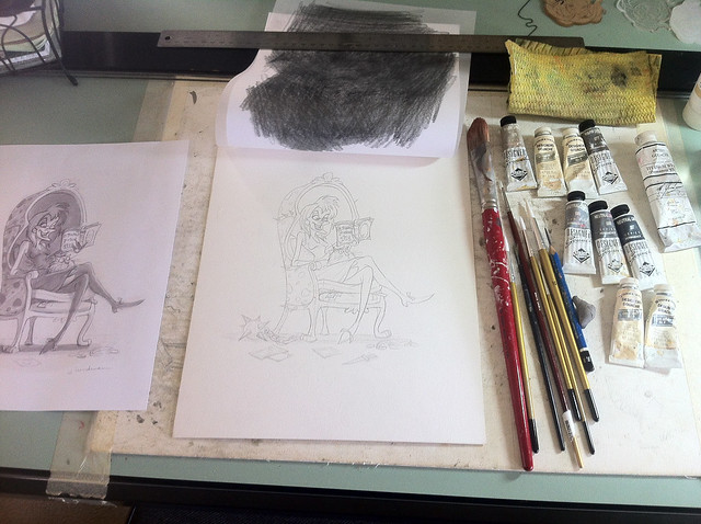
After I transferred the printed out drawing to a lightweight cold press illustration board, I painted a thin acrylic wash using the tan acrylic. This at first can be jarring because it tends to make the whole piece look dark and smears the lines a little, but when it dries the lines are in tact and the wash fairly clean.
After the acrylic wash was dry, I simply began to paint in flat values using the various grey gouaches mixed with a little titanium white gouache at times. I spent a lot of time fiddling with the layers, being careful to not let the gouache get too thick.
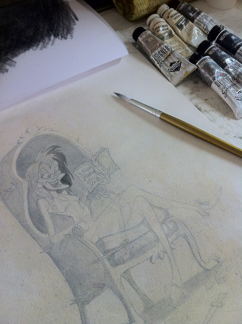
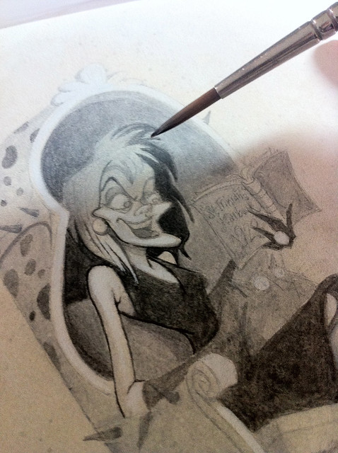
After I painted the grey tones I painted in the line work. This took longer than any other part of the rendering process, but was probably the most fun of all. In fact, I am now thinking about seeing what I can do with this technique on more Disney villains - just for fun!
Please stay tuned if you have been following my posts on studying the Flemish Method with Sadie. I have finally finished the piece and will post about that VERY SOON!
Thanks for reading!


