2016

Being a Capricorn, I have always been driven to succeed. It is frustrating to me that even with all my heart and intentions, I have yet to complete some of the many goals I set out to complete way back in my 20's. There are, of course, many complicated life reasons for this. 

This year I've decided that no matter what, I will accomplish a few of my big art goals, no matter what. 

Seven times fall, eight times stand up. 

I did an alternate, darker version of this painting as well. I can't decide which I like better. 

Happy New Year 2016!

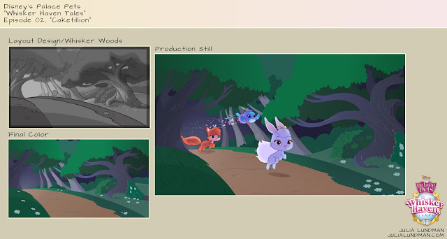
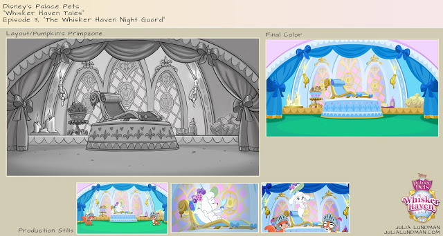
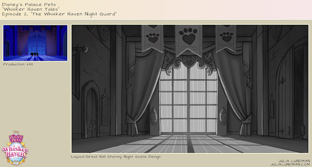
Disney's Palace Pets "Whisker Haven Tales"/Environment Designs and Color Keys

I recently had the honor of working with Ghostbot and Disney Publishing on ten 3:30 minute episodes of Disney Junior's "Whisker Haven Tales with the Palace Pets", directed by Alan Lau. Episodes can be seen here: 

www.DisneyPalacePets.com 

My primary role was to develop background "key" environments working from the approved animatics. If you aren't familiar with animation, a color key is an environment design that establishes a location, color palette, and lighting. It is then referred to by other artists on the  the team that need to create various points of view surrounding that piece of the film in the sequence. Elements like water that animate were tricky, especially bubbles. We had to take a close look at how bubbles looked under the water and out of the water. 

Time of day was a major consideration in many episodes. I created guides for blocks of 2-3 hours for each time of day so that the color remained consistent throughout the episodes. 

More episodes will be available soon via the Disney Junior Watch app on iTunes! The show is doing very well. It was a pleasure to work with Ghostbot and Disney on this exciting new show! 

Disney's Palace Pets, "Tales From Whisker Haven"/Color Scripts!

I recently worked on ten 3:30 animated episodes for

Disney's Palace Pets

, a new show on

Disney Junior

. There is also a new Palace Pets Website (!!!) which can be found at

www.DisneyPalacePets.com

The show was developed and produced at

Ghostbot

, directed by the talented

Alan Lau

. It was such a fun project for me personally as I served as Art Director on environments, props and color design. The show was definitely challenging as the Palace Pets have been a successful toy line for Disney for a while now and have a multicolored pastel palette. For this reason, color scripting was necessary on several of the episodes for either a full episode or portions of sequences that were particularly tricky to work out.

Below is my color script for my favorite episode, "The Knight Night Guard". (available to watch on the Disney Junior app now!) Color scripts, if you aren't familiar with them, are a way to get a big picture take on the color design for an entire episode or sequence. It is important to focus on the storytelling as scenes move from shot to shot and sequence to sequence, and make sure the planning for the lighting and effects is consistent logistically from one scene to another. They also are very helpful for animators so they can get a big picture idea of what it is we are shooting for, and also are very helpful for the compositor when piecing together all of the various elements into one shot. Additionally, I enjoy designing color scripts since they give me a chance to think globally about how I want to approach the design of specific environments and how much work I will need to do for specific areas of a sequence, and the work load we are facing in terms of environments and props for a particular episode or sequence.

Below are some stills from Episode 3. They translated pretty closely to the color script - good planning is worth it!

Below is a partial color script for Episode 4, "Throwing a Ball". I didn't have time to do a color script for the entire episode so I focused instead on a tricky sequence that takes place with a time of day change.

Below are a few shots for the final. (Additional characters were added after I did this initial color script.)

I actually did a few more of these but those episodes are not yet released. 

Please check back for updates and be sure to watch Palace Pets "Tales of Whisker Haven" on Disney Junior! Next week I will post about some of the environments and props I designed. Thanks for reading!

Monterey Bay Aquarium/Color Studies & Sketches

Jamie and I recently went on a trip down the coast to the Monterey Bay Aquarium, one of my very favorite places in the world. We both brought our drawing, sketching, and painting supplies, including my new samsung tablet. Because most of my color sketching was going to be done inside the aquarium, I carried around my tablet in my messenger bag and took it out when I saw something I wanted to study.

As mentioned in my previous post, the primary reason I purchased the tablet was so that I could do a lot more color studies of interior lighting in situations where it would be difficult to take out my usual paints or pastels, places like restaurants, cafes, aquariums, museums, unusual interior lighting situations. Boy am I glad I did. Each time I would sketch from life in the aquarium, I would take a photo before I left. When I would look at the photo later, I noticed a HUGE difference - the camera most of the time did not capture the lighting effects I observed, and if it did, the spirit of that light was completely lost, subdued, or just not there. What an amazing learning experience!

***************************************************

Below are a few of my digital studies. I also did numerous pencil and watercolor studies of the animals in the aquarium, and a few pastels from up the coast. I will post those next week.

 The Kelp Forest. So glad I brought my noise canceling headphones for this one. There were deafening crowds of pre-teens on a field trip with their school. You never know what will confront you when plein air sketching - I highly recommend headphones if you sketch in public places. 

I liked the presentation of this display so much. The blue light spilling from the water and the  yellow-green reflections of the kelp were gorgeous. I felt the design stood well on it's own.

The sketch above is downstairs looking into the Sea Otter display, sea otters mostly spending their time up above water and only occasionally diving below. I noticed this perch watching people as they went by and thought it was funny...

Some sketches went faster than others. This one in the Deep Sea Exhibit was done in about 30 minutes. It was at the end of the day and just seemed to flow. I figured out a composition and story as it evolved in front of me. 

Of all the subjects I studied in the aquarium, this jellyfish display was absolutely the most difficult. I sat across from the display on the floor against a wall in almost total darkness. My eyes had adjusted to the dark, but when I looked down into the bright computer screen of my tablet, my eyes would adjust to that brightness, so that when I looked back up again at the jellies, I had to give my eyes a moment to adjust to the darkness again. VERY tough! I spent a good two hours trying to capture the light of the tank. Wow, what a learning experience this sketch was!